Reagan Mckenzie
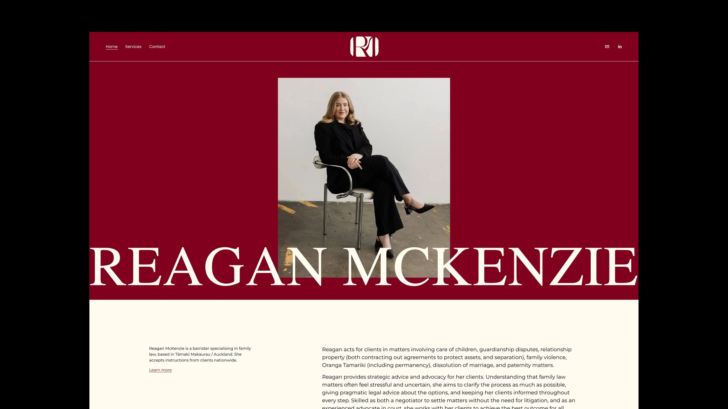
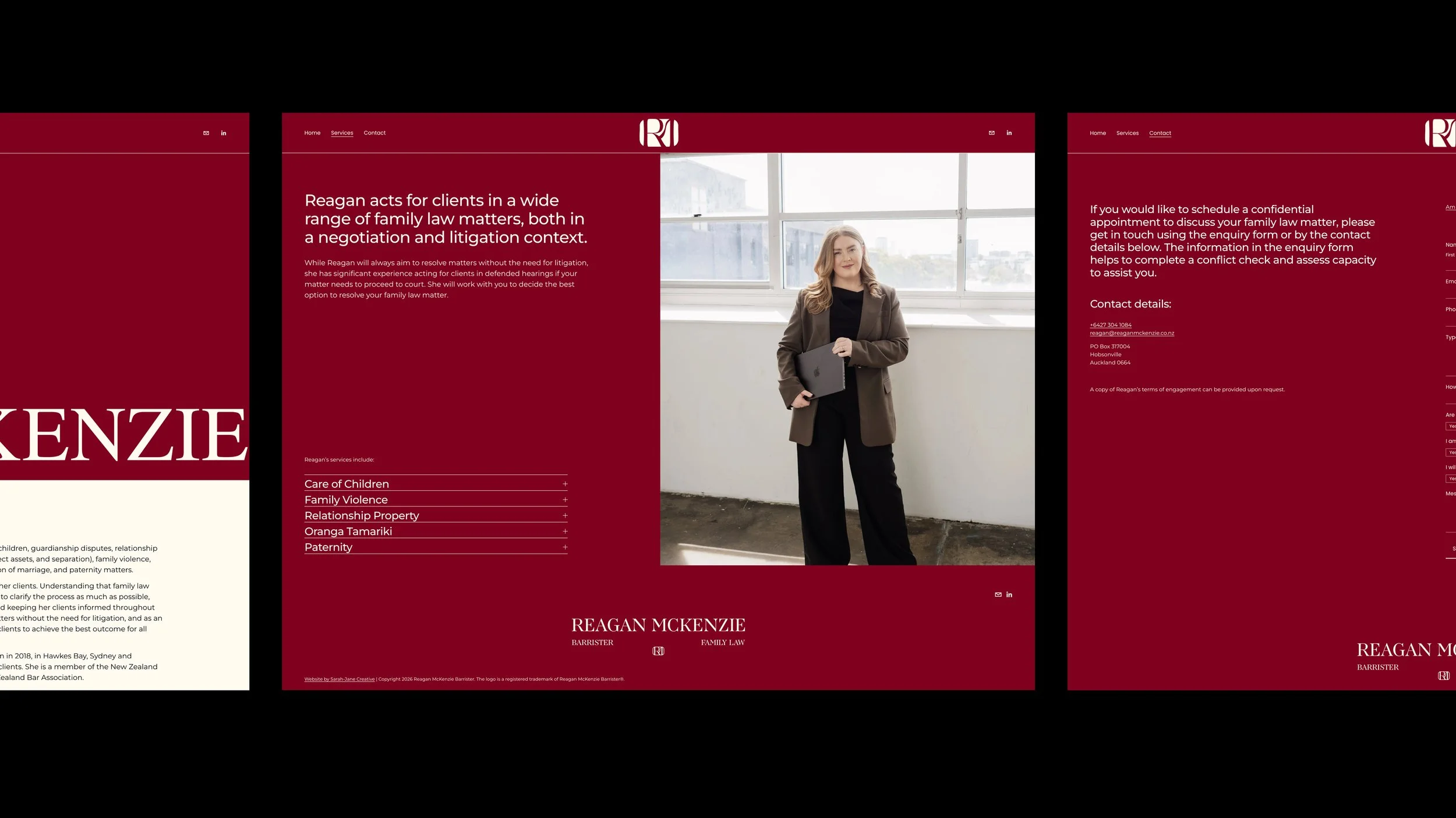
This brand has been created to strike a balance between professionalism and individuality. It was designed to communicate credibility and trust while standing apart from the more traditional and often uninspired branding commonly seen in the legal industry. The result is an identity that feels both classic and stylish, providing a strong and distinctive presence within the field.
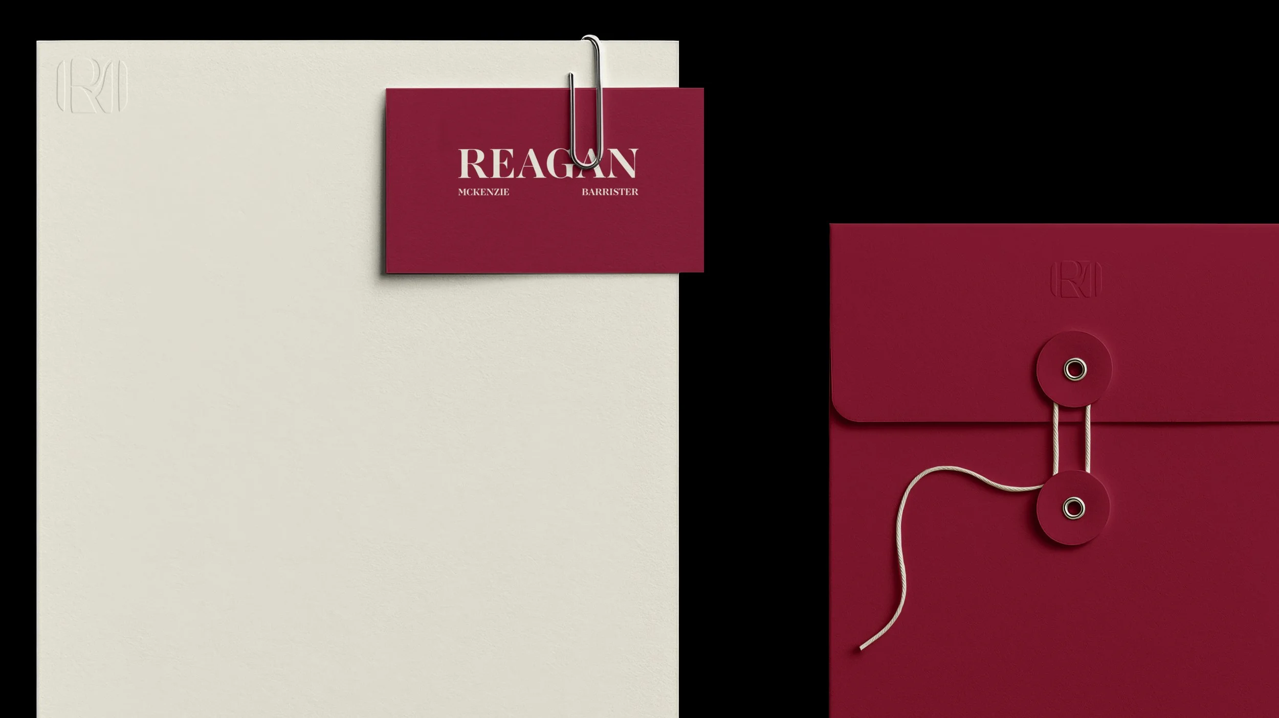
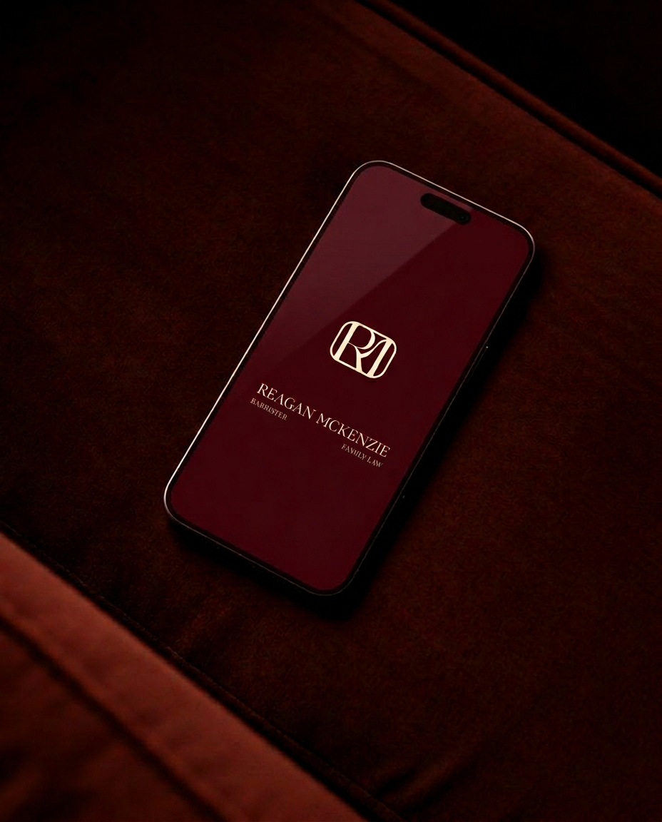
A refined serif typeface has been selected for the wordmark, chosen for its ability to convey authority and expertise while maintaining an elegant and confident tone. To complement this, a rich burgundy and soft cream colour palette has been developed. The burgundy adds weight, prestige, and sophistication, while the cream softens the overall look, ensuring the brand feels welcoming as well as professional.
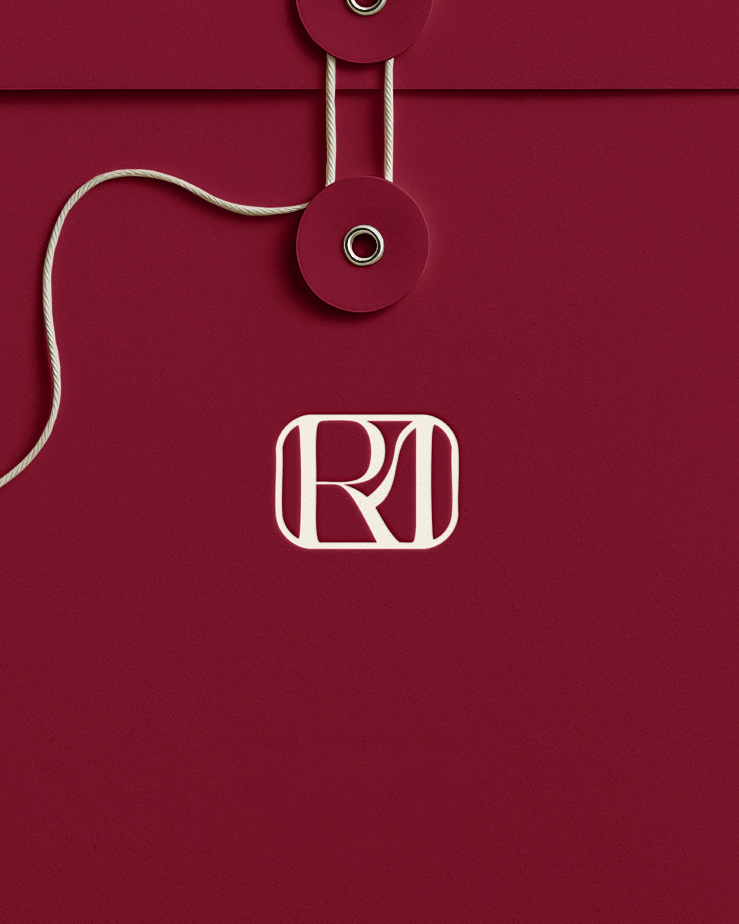
At the centre of the identity is a custom monogram created by merging the initials “R” and “M” into one distinctive mark. This symbol can be used alongside the full wordmark or independently across various applications such as stationery, signage, and digital platforms, forming a flexible and timeless brand system that is instantly recognisable.