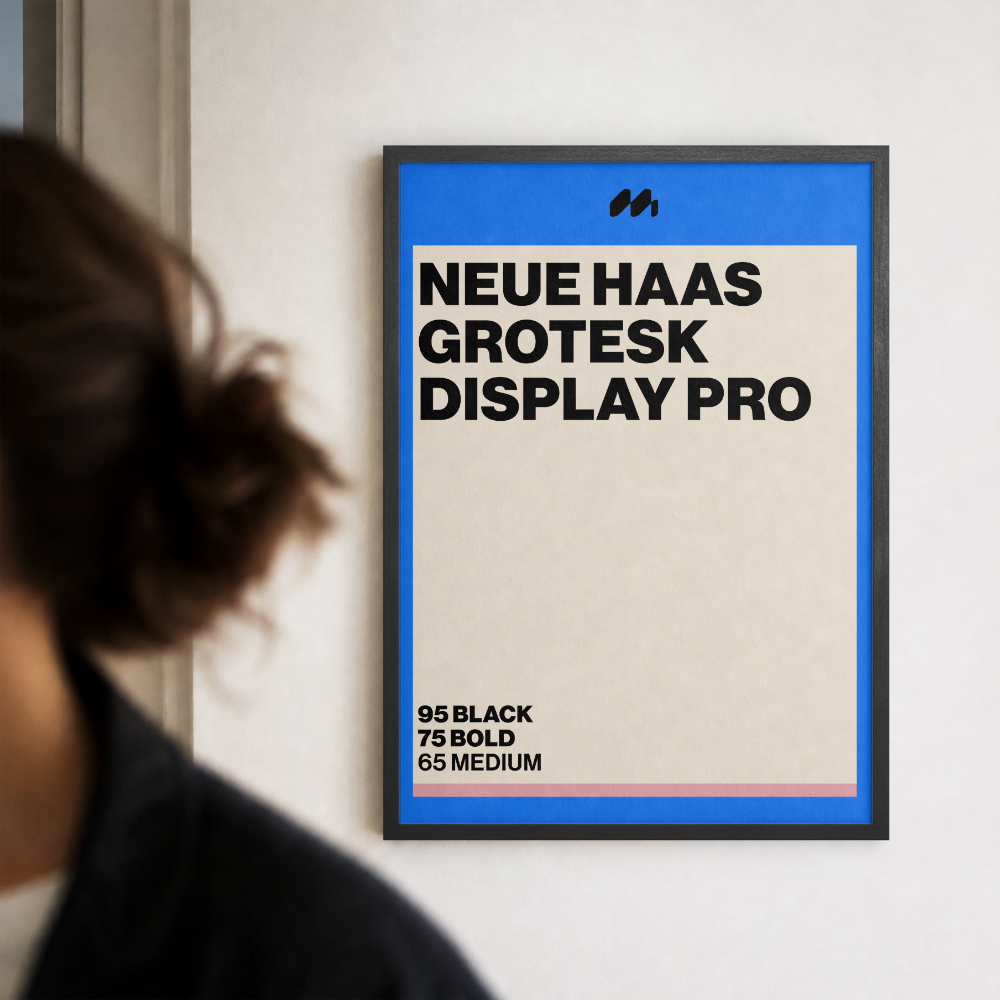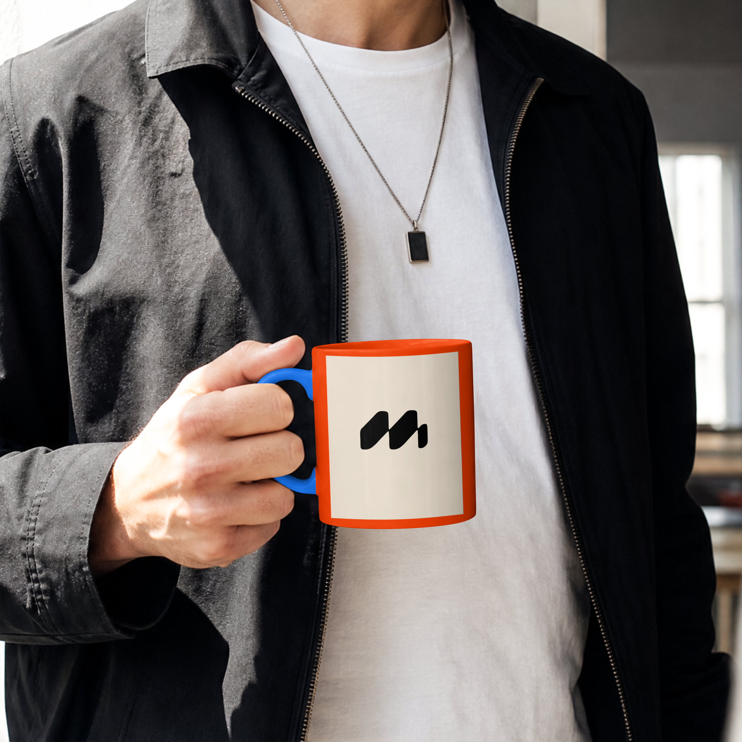
M - Brandmark
This brand mark was originally created for a client, though it didn't make the final cut. It's a concept I'm still proud of and wanted to share here.
The logo concept began with a grid-based structure, inspired not only by the visual direction, but also by the environment surrounding the brand. During the initial meeting, I noticed the Bauhaus artwork throughout the office. Bauhaus design is rooted in the principle that form follows function, with an emphasis on purposeful, geometric and considered design. This became a natural starting point for developing a logo that felt structured, balanced and intentional.
From there, I created a custom grid with an upward movement towards the right. This was a subtle reference to growth and progression, reflecting the upward trajectory that the brand helps its clients achieve. The movement also mimics a graph line trending upwards, creating a visual connection to the boardroom environment and the brand's focus on tangible results.
The concept then evolved to represent the long-term relationships at the heart of the business. The repeated form within the structure represents partnership and support, reflecting the idea of working alongside clients as they grow. The two shapes move upwards together through the grid, creating a visual representation of collaboration and shared progress.
The overall structure also forms a soft 'M' shape, creating a secondary connection to the idea of mastery and expertise.
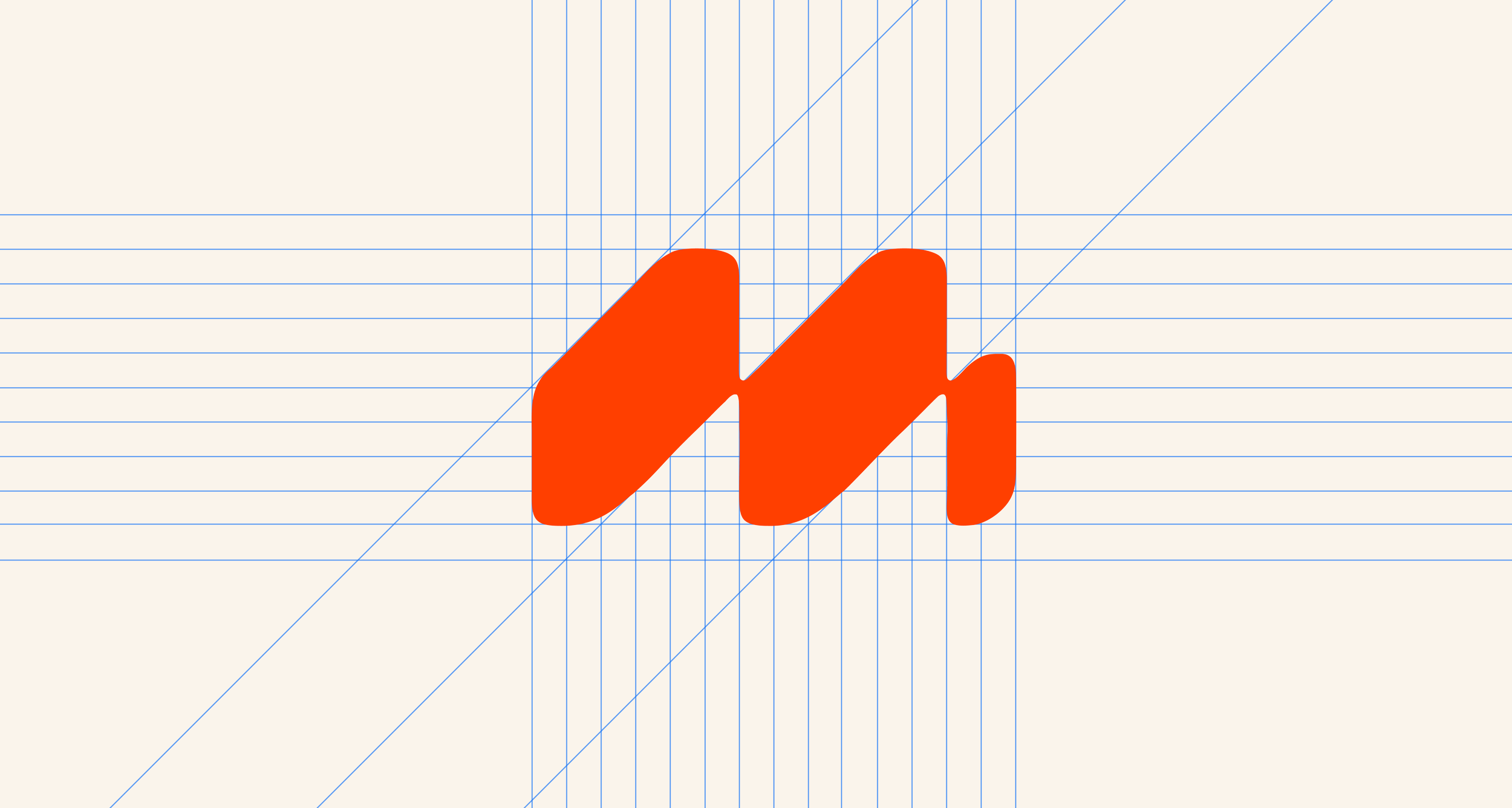
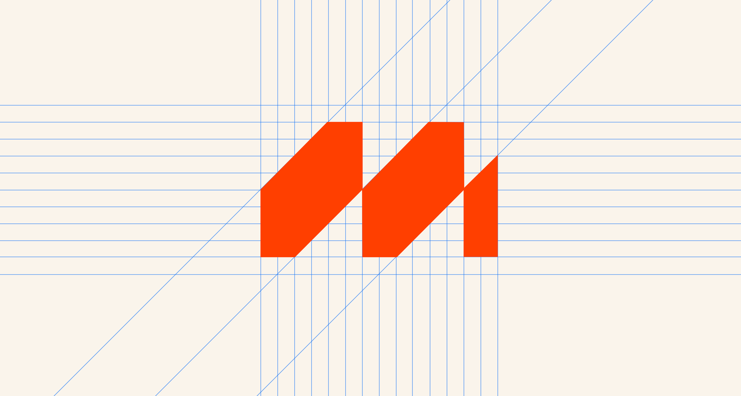
As you can see above, I started by building the shape within a structured grid, reflecting the strategic and data-driven side of the business. The grid represents structure, tangible results, and a considered approach to business growth.
But two things can exist at the same time. While strategy is at the heart of the business, they also pride themselves on being warm, approachable, and welcoming. With this in mind, I introduced softer curves into the form to create a more human feel.
The result still sits within the original grid and retains its underlying structure, but the softened edges make the mark feel more flexible, approachable, and less rigid.