Arlo
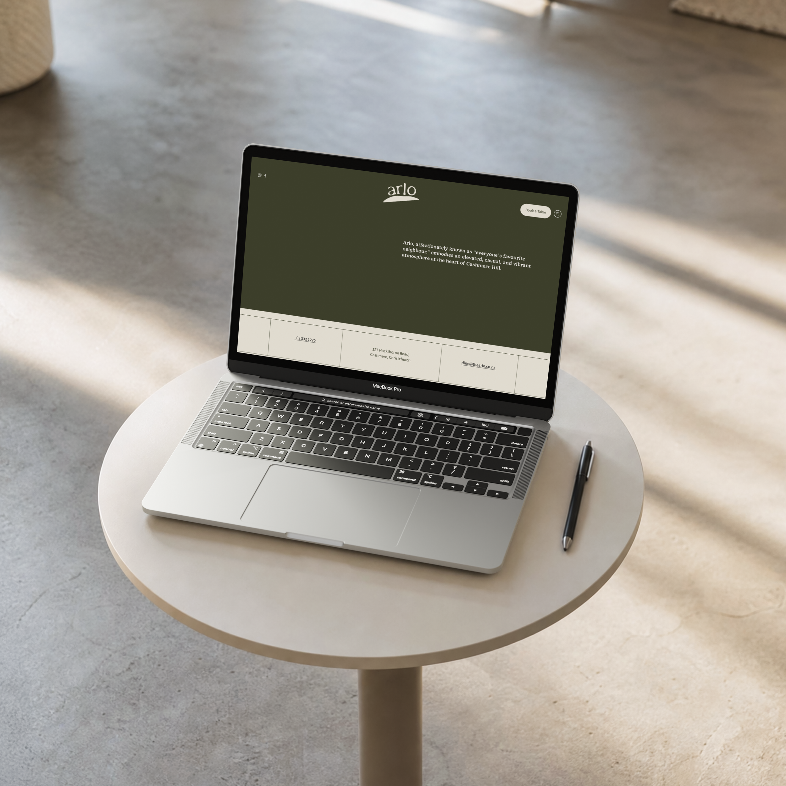
Arlo, affectionately known as "everyone's favourite neighbour," is a vibrant new restaurant nestled in the heart of Cashmere Hill, Christchurch. The name Arlo is rooted in Old English and means fortified hill, reflecting the venue's connection to its natural surroundings and its history as a cultural hub. Arlo itself is elevated yet relaxed, and we wanted every part of the brand to carry that same feeling.
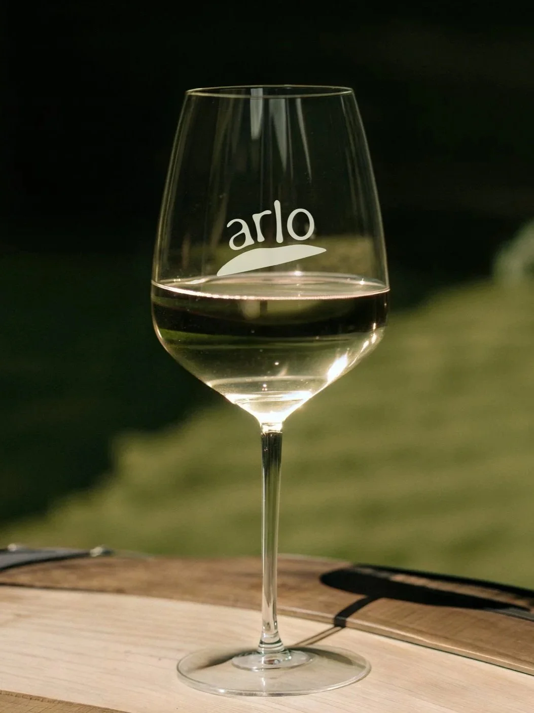
The branding captures this with a warm, organic feel. A rounded, handwritten typeface gives it a friendly, welcoming vibe, while the spacing and proportions stay considered and well balanced underneath. The result is a classic, timeless quality that complements Arlo's elevated yet casual atmosphere.

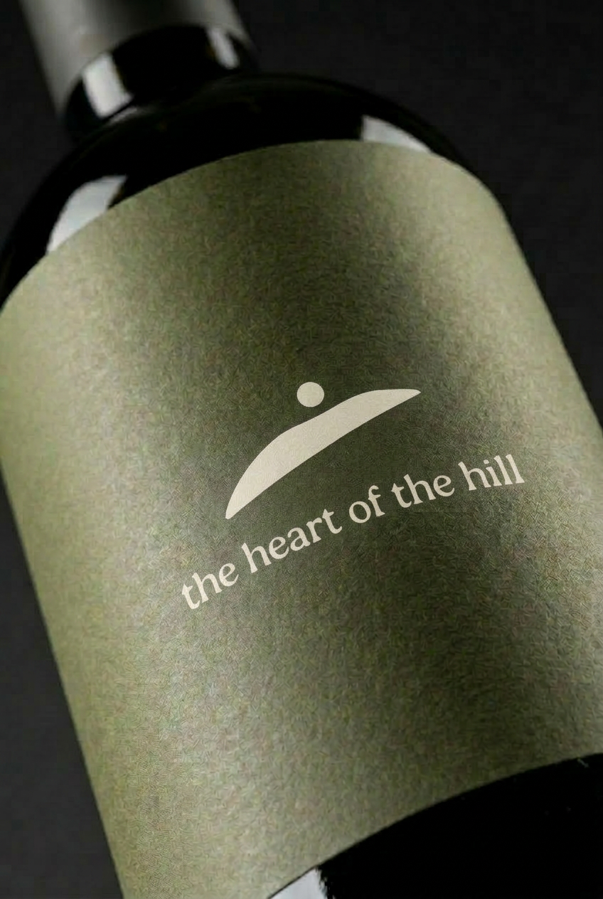
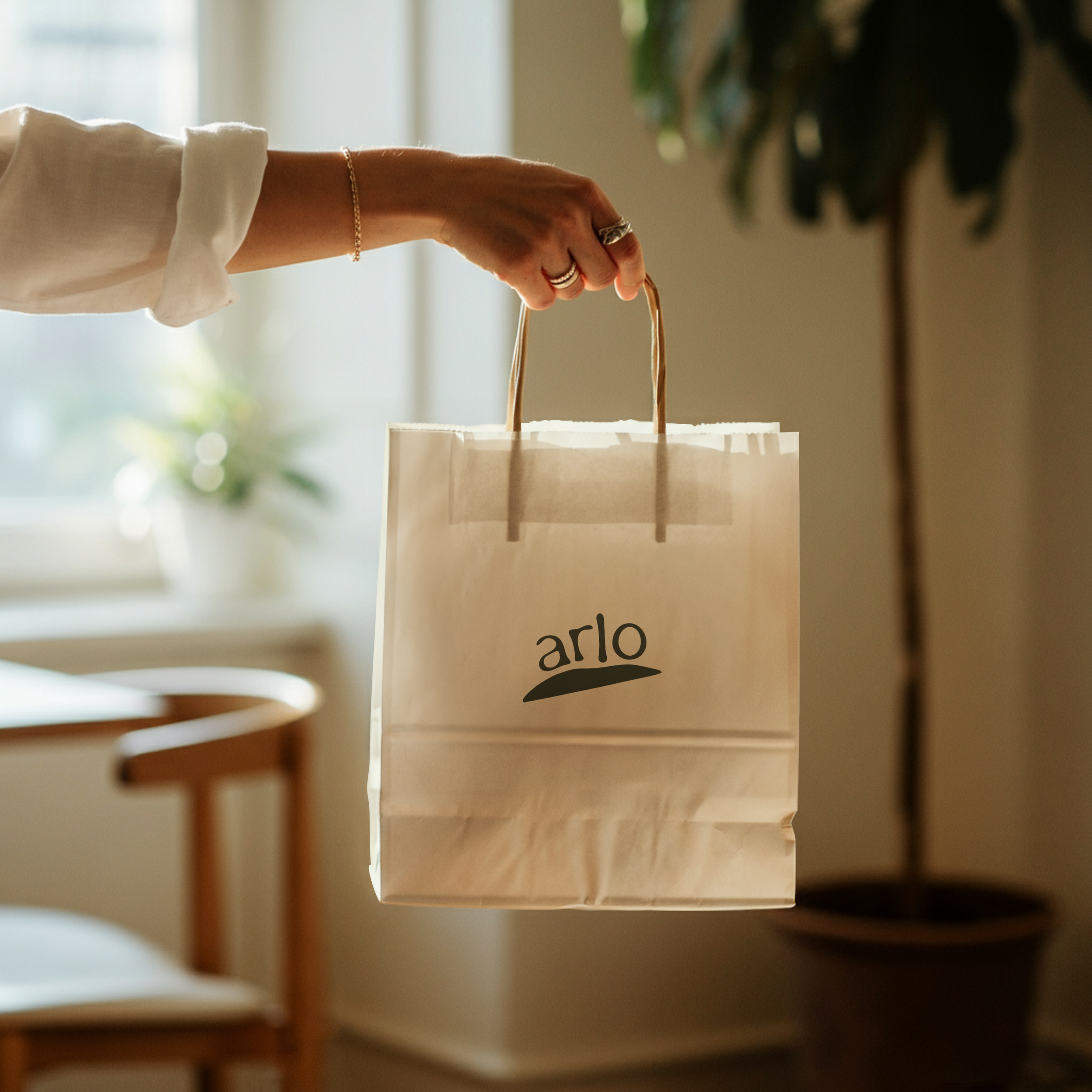
Before the typeface came the shape that sits beneath it, a hill that rises, dips, then rises again. That dip marks exactly where Arlo sits, and it's where the L of the wordmark drops in. Perched atop the hill, the logo symbolises Arlo's role as the community's gathering point.
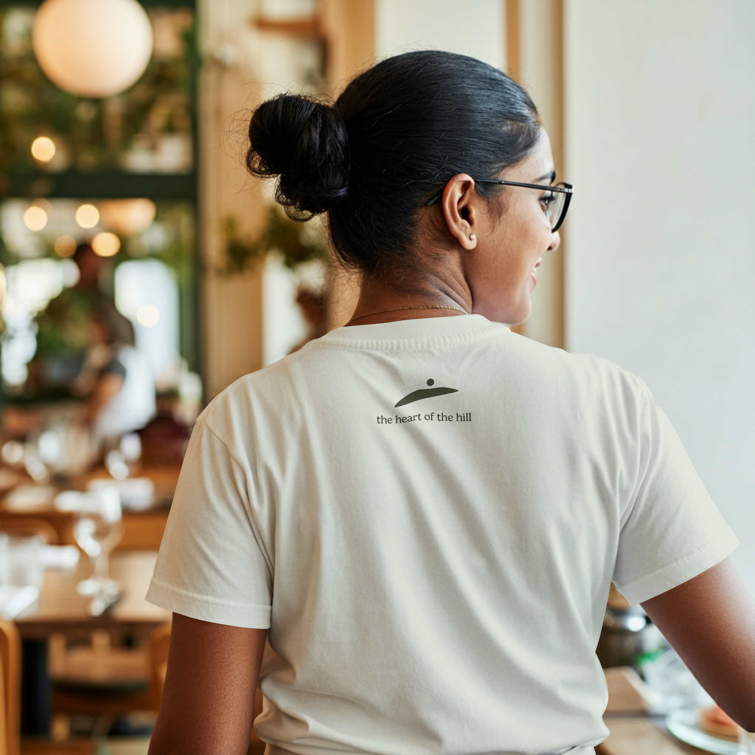
For the icon, we took that same hill shape and added a circle dipping down into where Arlo is located. There are two ideas at play. The first is place, marking where Arlo sits in the hills. The second is sunset. Arlo is one of the best spots in Ōtautahi to watch the sun go down behind the mountains, so the icon reads two ways at once; a pin on the map and the sun setting behind the hills.