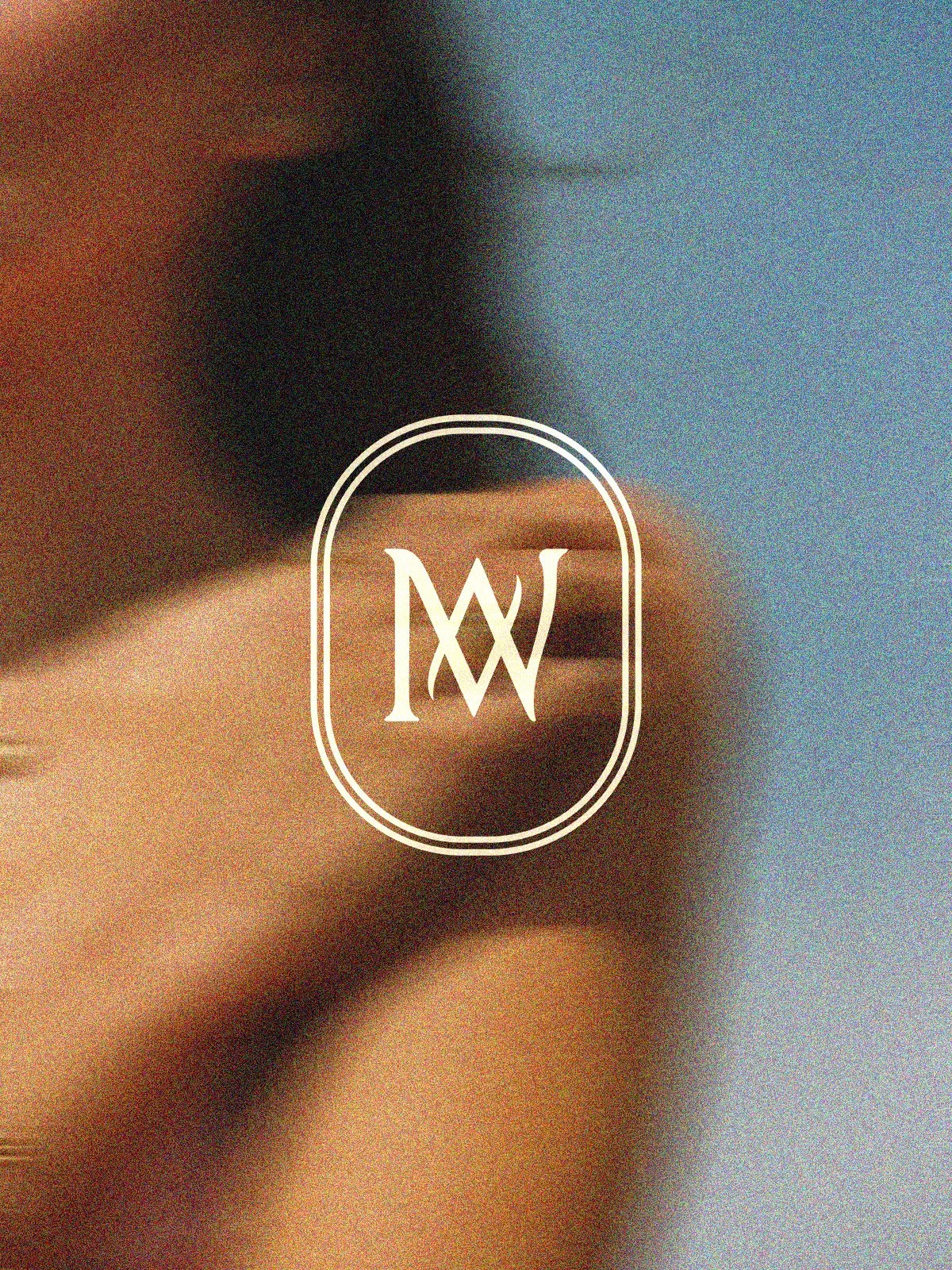
Manawa
The manawa brand was created with the intention of being slow, meaningful, and deeply considered. Each piece of jewellery is crafted by hand, and we wanted the logo to reflect that. The icon is a subtle fusion of the letters m and w, combining curved elements reminiscent of the ocean with strong, grounded lines like the rocks, symbolising both where the jewels are from and how the jewellery is made.
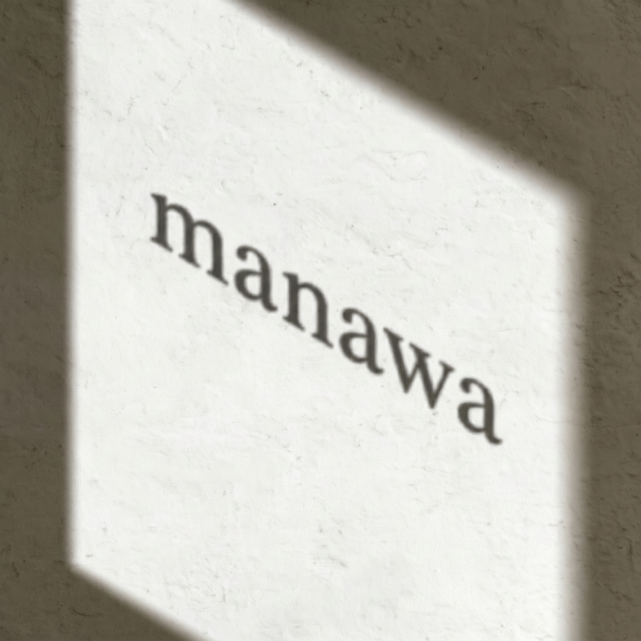
The manawa wordmark was carefully designed to evoke the quiet elegance of a serif typeface, in this case, Iowan Old Style. I refined the type further by softening the corners and adjusting the letter spacing to allow for gentle breathing room between each character. The all-lowercase composition gives the logo a calm, grounded presence, creating a visual rhythm that feels intentional and reflective. Each letter carries equal visual weight, resulting in a logo that feels balanced, deliberate, and quietly confident.