Earl
The brief was to evolve the Earl brand to reflect its new direction, creating a visual identity that matched the fun, bold personality and relaxed tone of voice behind the space. The goal was to position Earl as somewhere people could come for incredible food and great service, but without the formality or pressure often associated with dining out. It needed to feel welcoming, relaxed, and social. A place to settle in, order another drink, eat the pasta, and stay a while.
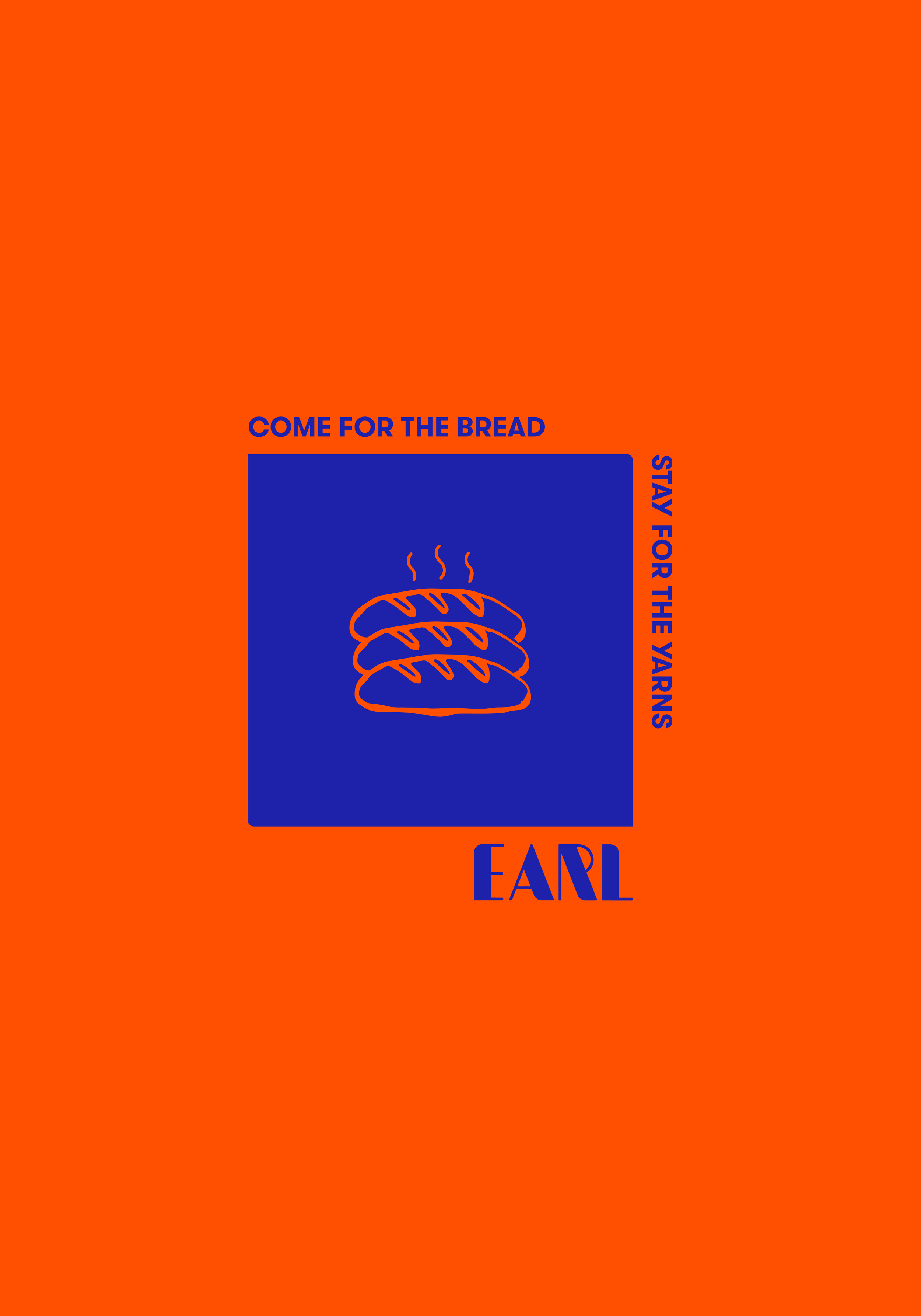
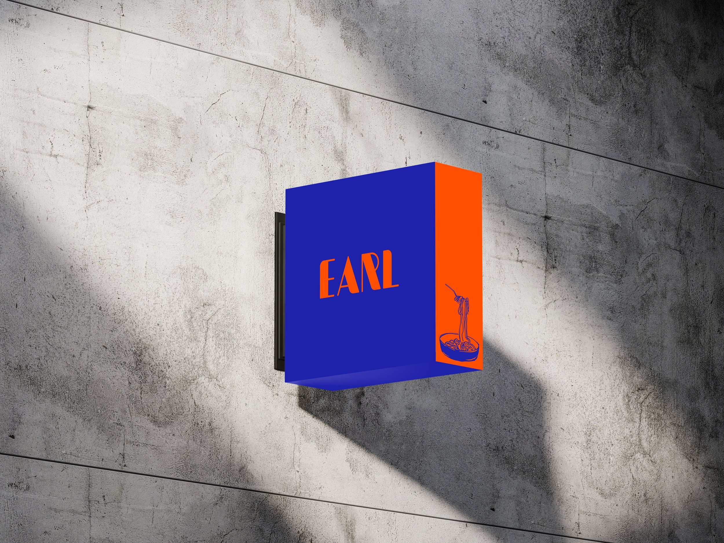
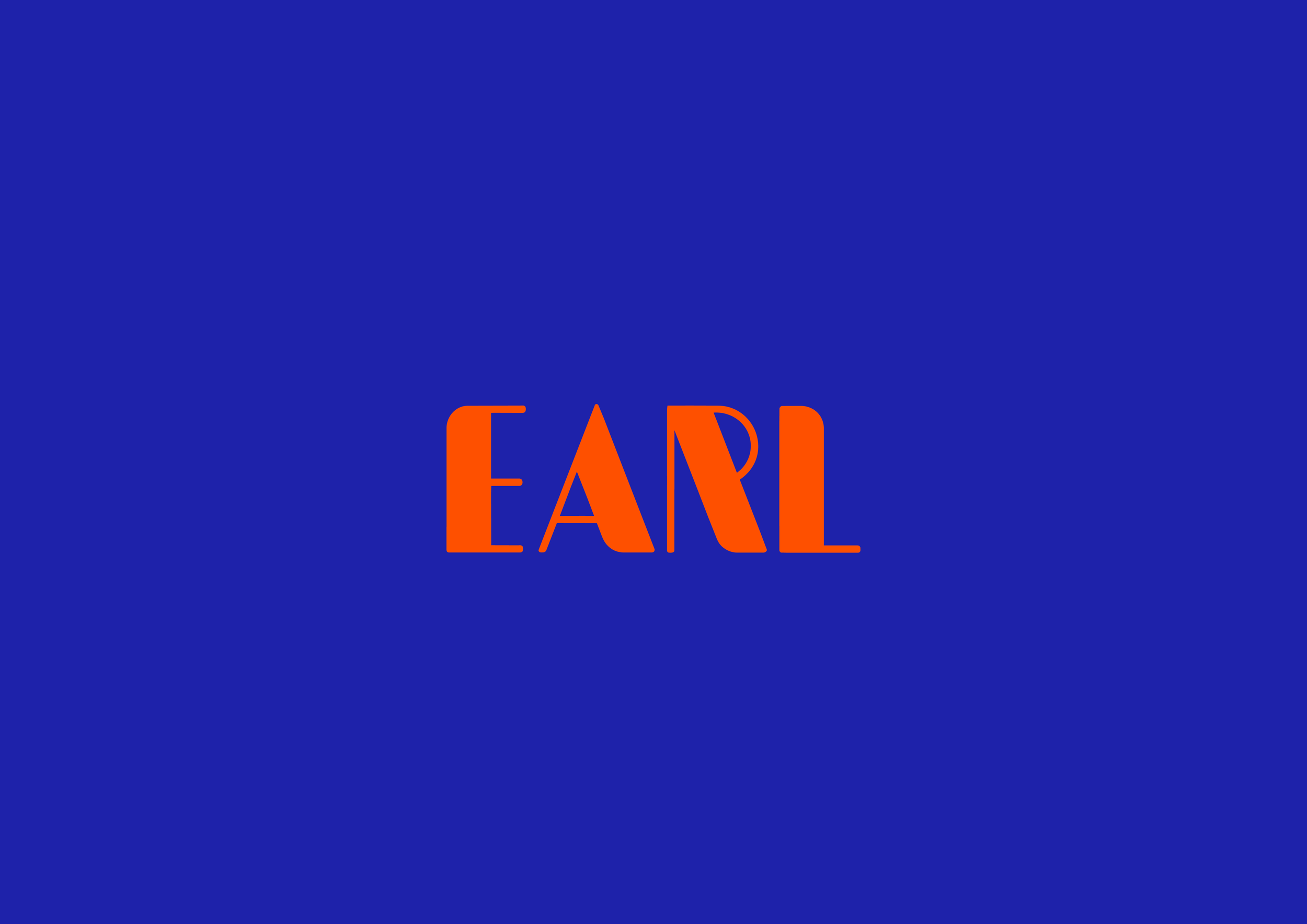
The existing logo was refined by selecting only the filled wordmark version, as it had the strongest impact and improved visibility across signage and print applications. Slightly bolder lines and softer edges helped modernise the brand while keeping it familiar and recognisable. The colour palette was also updated to feel stronger and more energetic, especially given Earl’s location near the new Christchurch stadium. Bold blue and orange tones were introduced to create more impact, while softer variations allow flexibility across interiors and more subtle applications.
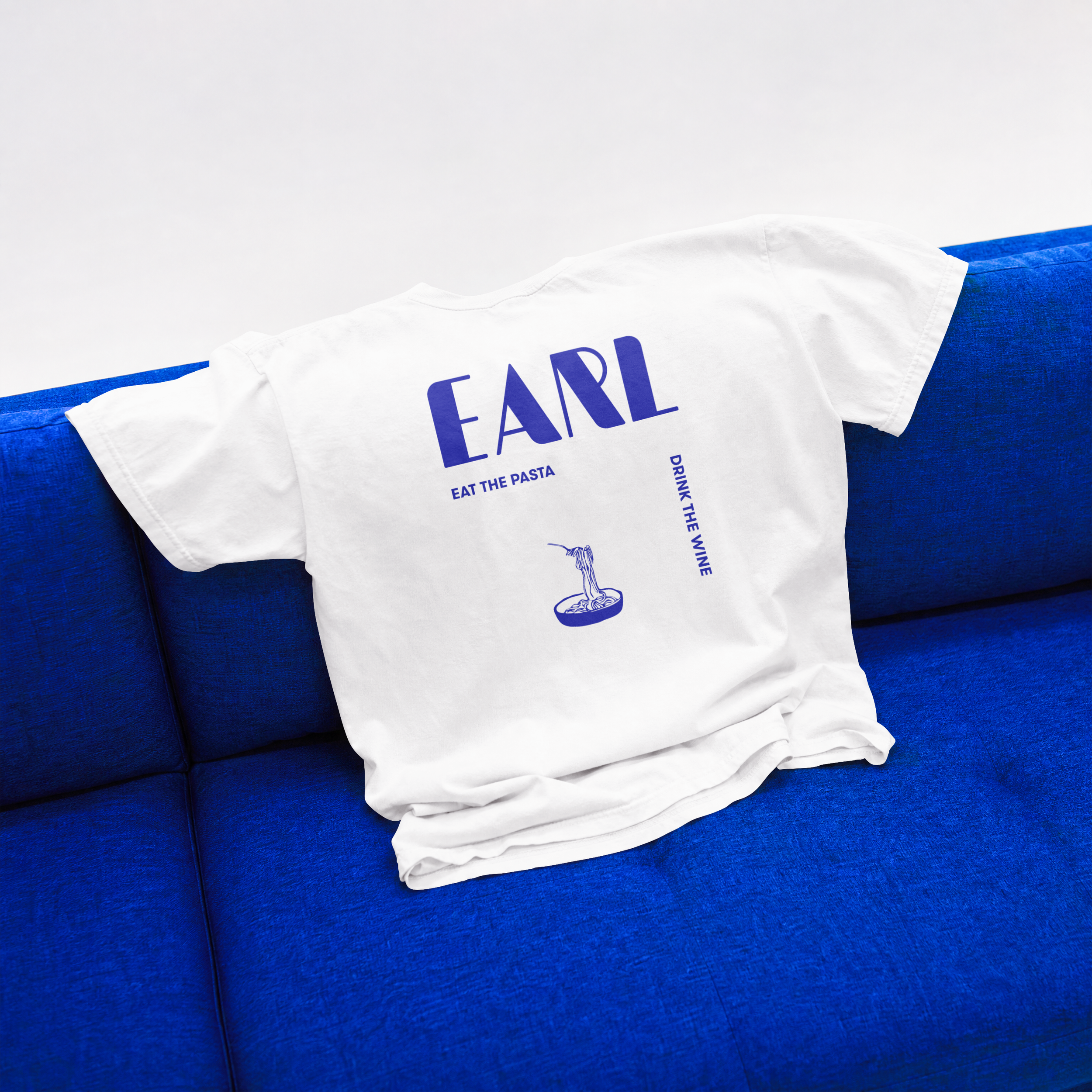
To support the wider identity, a custom icon set featuring pasta, bread, wine, and chairs was created. The icons were designed to feel slightly rustic and handmade while still carrying the bold and playful nature of the Earl brand.

Before
After
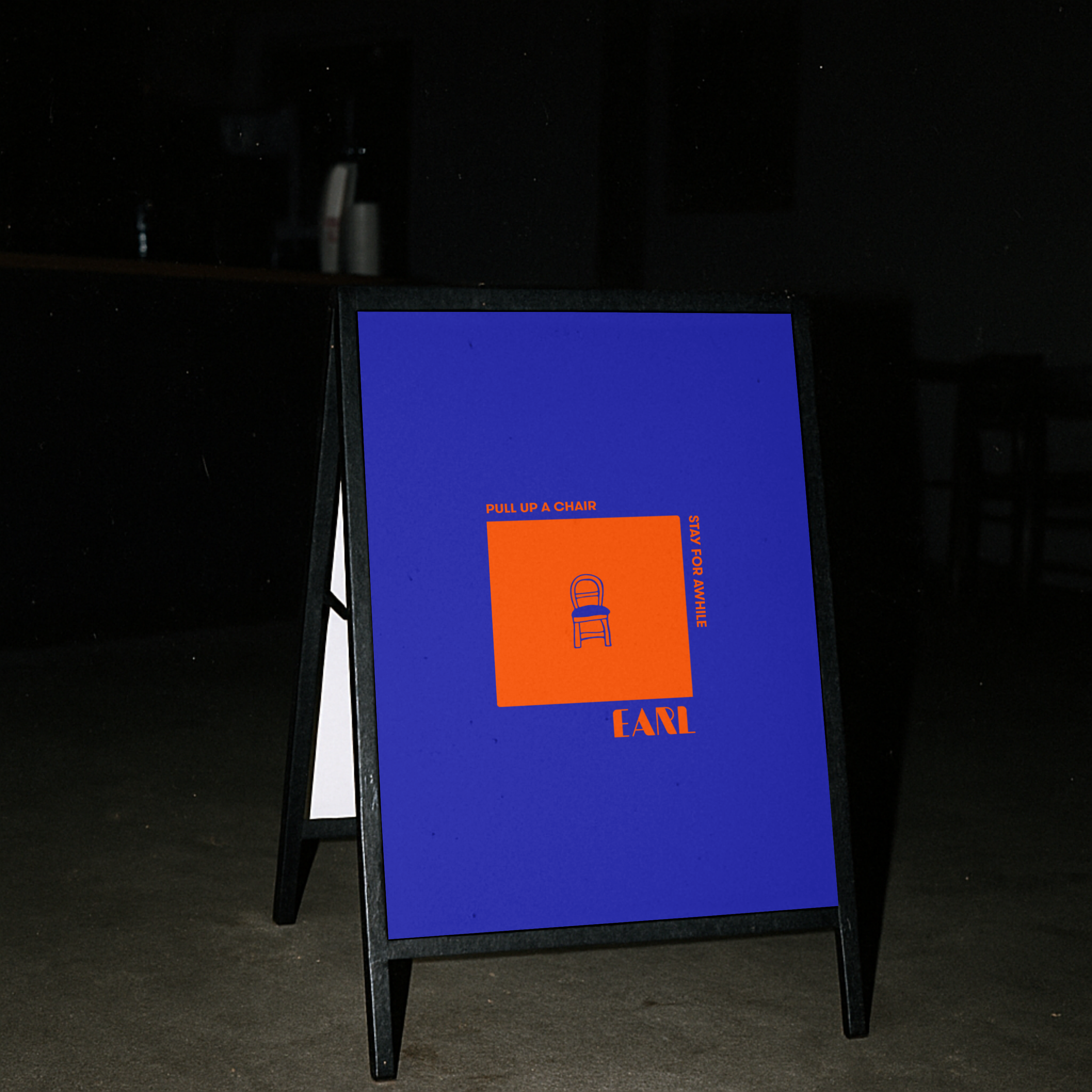
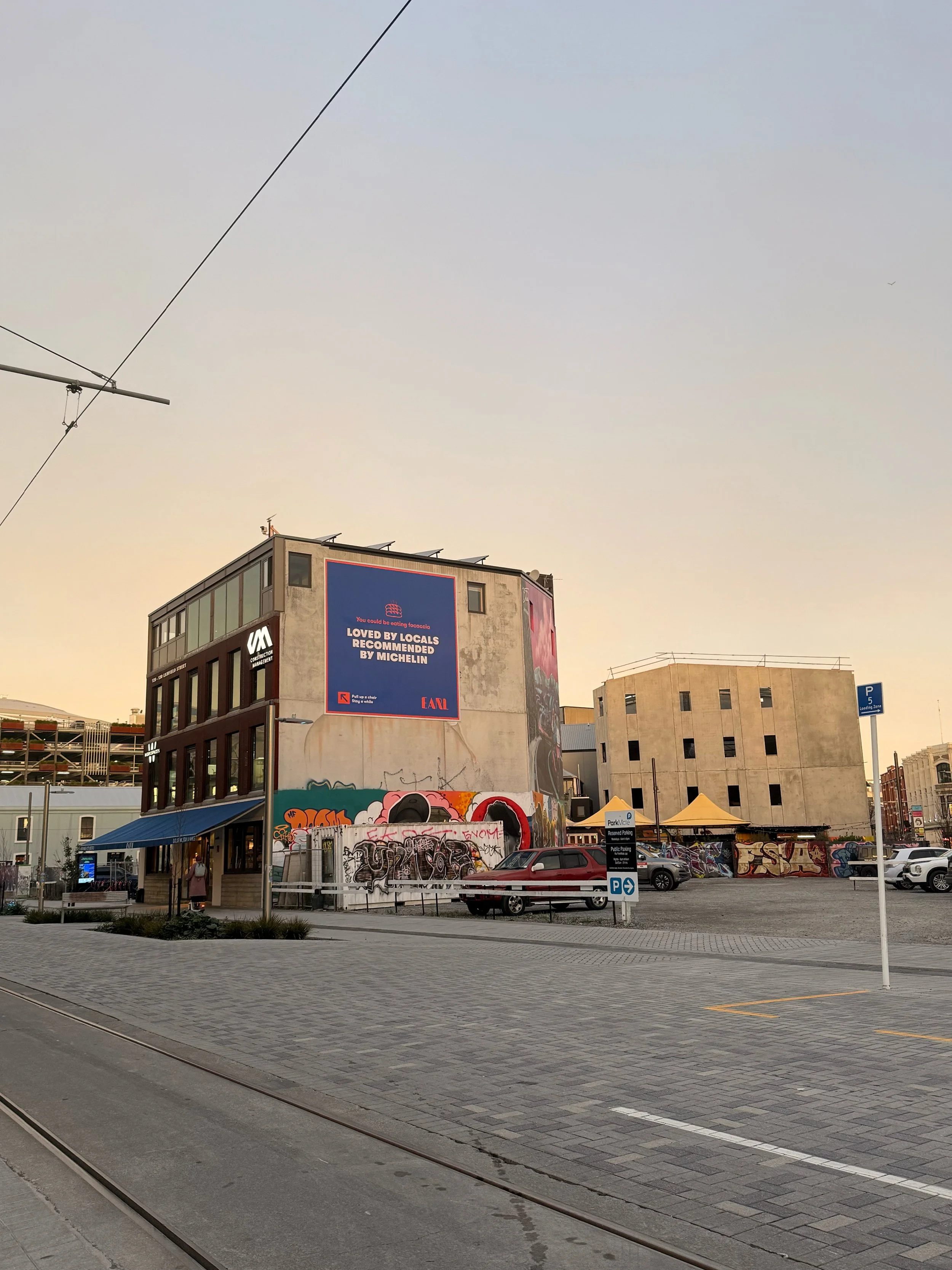
Alongside the visual identity, we refined the tone of voice and messaging to feel warm, confident, and effortless. Simple phrases like “eat the pasta, drink the wine” and “pull up a chair, stay a while” helped bring the brand personality to life across social media, signage, and campaigns.