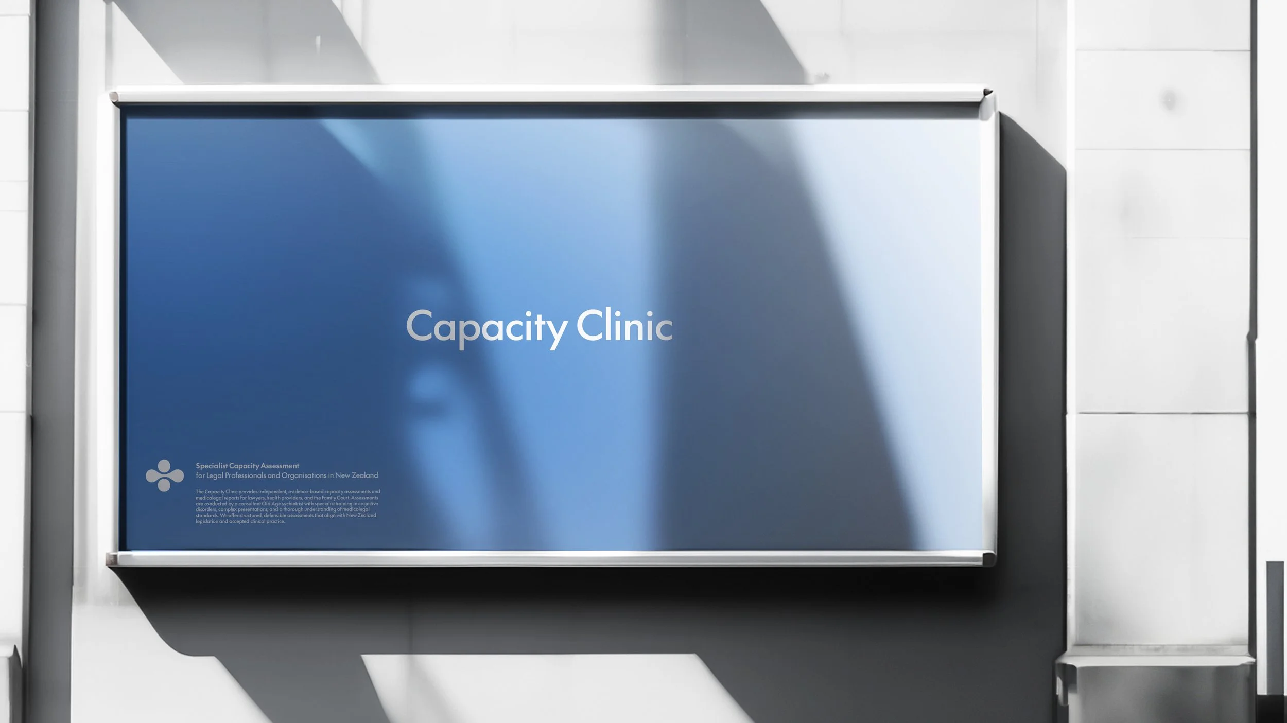
Capacity Clinic
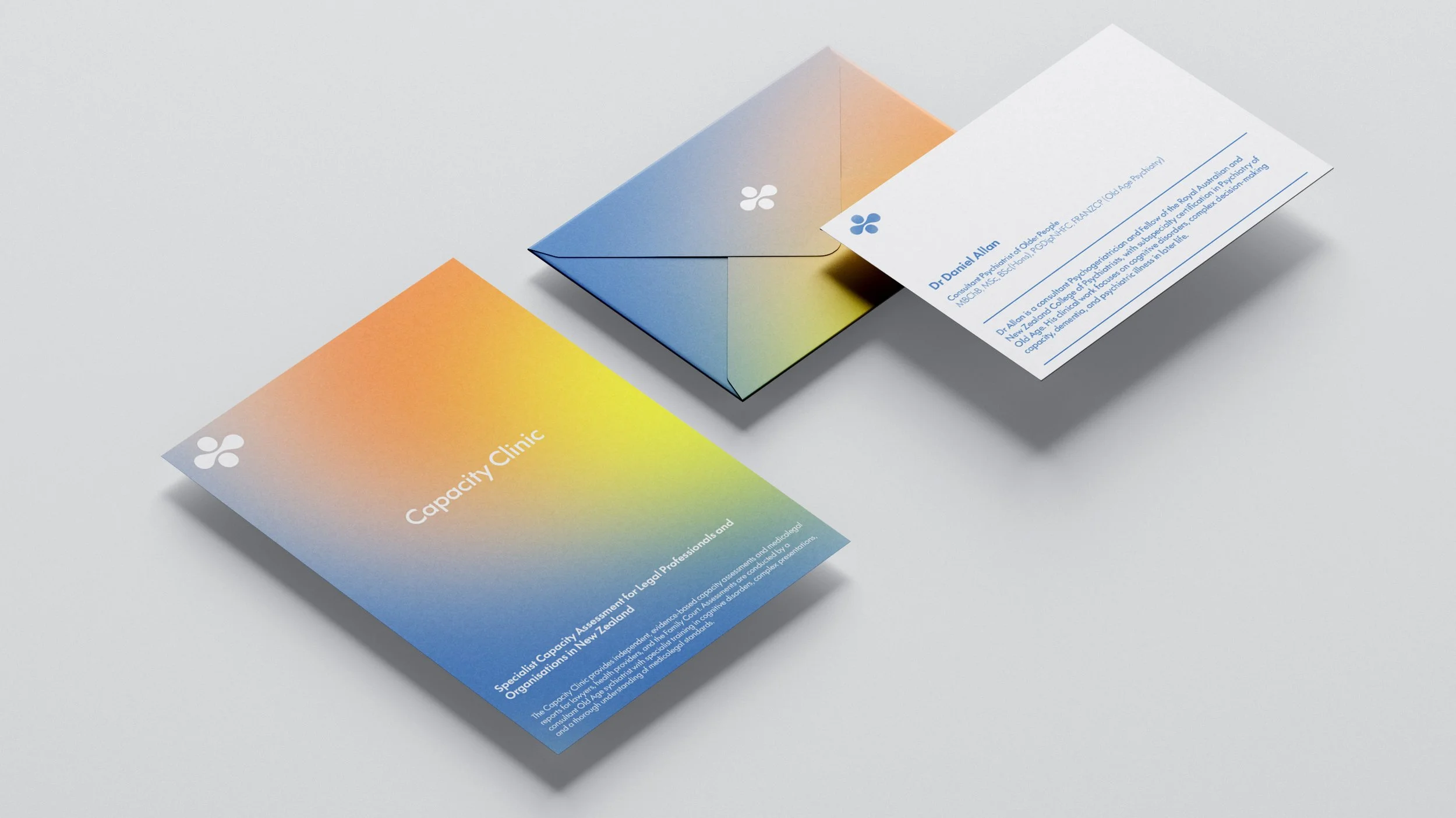
Branding, Strategy, Design, Website
Capacity Clinic works in a specialised space where clinical expertise meets sensitive legal processes. Because of this, the brand needed an icon with a deeper purpose. It had to feel calm and reassuring for clients and families, while also presenting as professional and credible for lawyers, health providers, and the Family Court. The goal was to create a mark that reflects the science behind capacity assessments, the idea of support, and the gentle nature of this work.
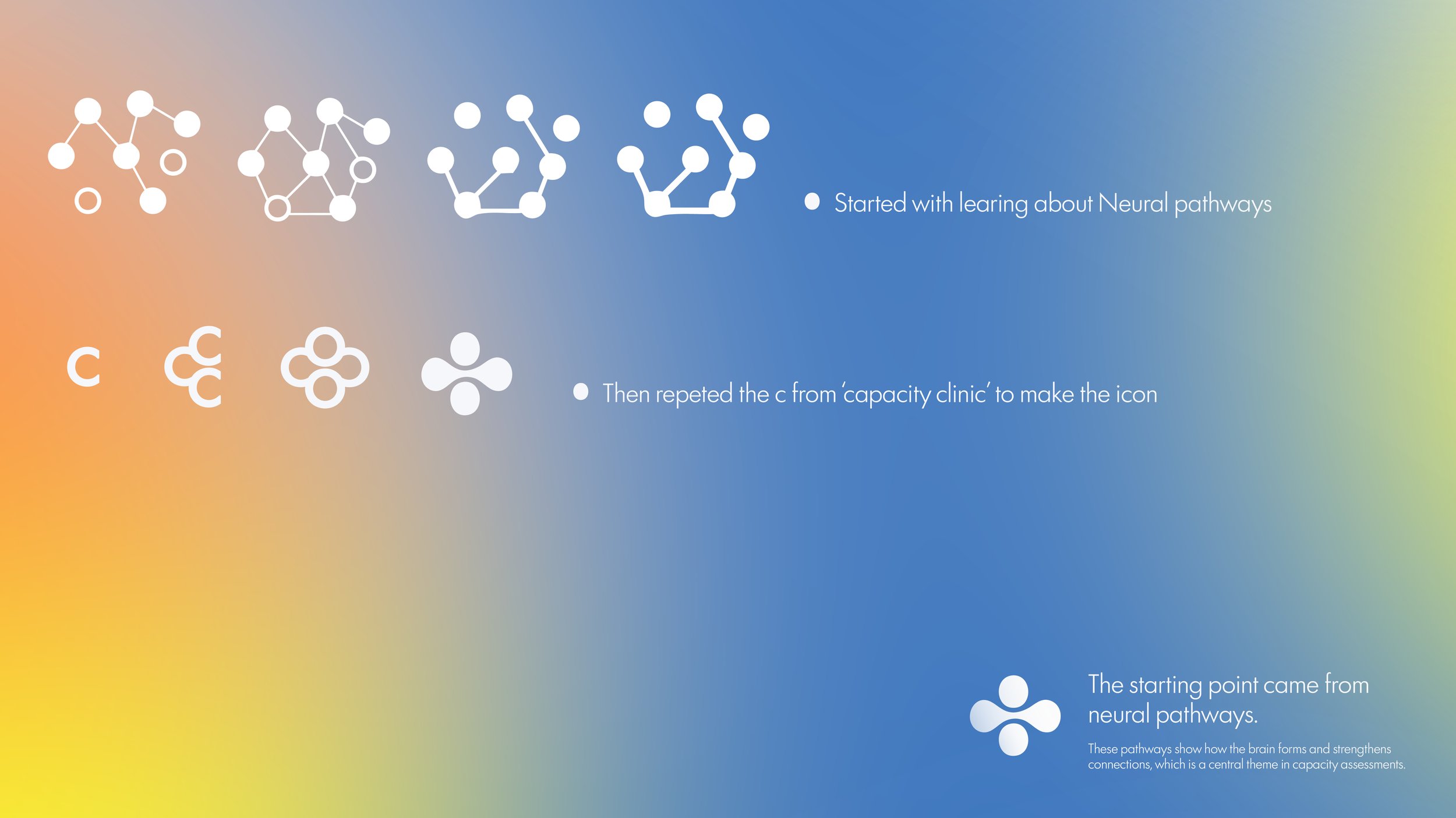
The starting point came from neural pathways. These pathways show how the brain forms and strengthens connections, which is a central theme in capacity assessments. Using some reference images, I looked at how neurons branch, how signals move across the brain, and how these pathways naturally create soft rounded shapes. This helped guide the direction for an icon that feels organic rather than clinical, and warm rather than intimidating.
I began the creative process by taking the c from the logo typography. I often like to build supporting elements from the type itself so the shapes and lettering feel connected. I then repeated the form, almost like creating a small cluster of neurons. As the shapes were layered and joined, they formed a gentle outline that hints at a brain without becoming literal. The negative space between each curve naturally echoed the structure of neural pathways, and the overall shape gave a subtle nod to a first aid symbol. This ties into the clinical nature of the service while still feeling soft and approachable.
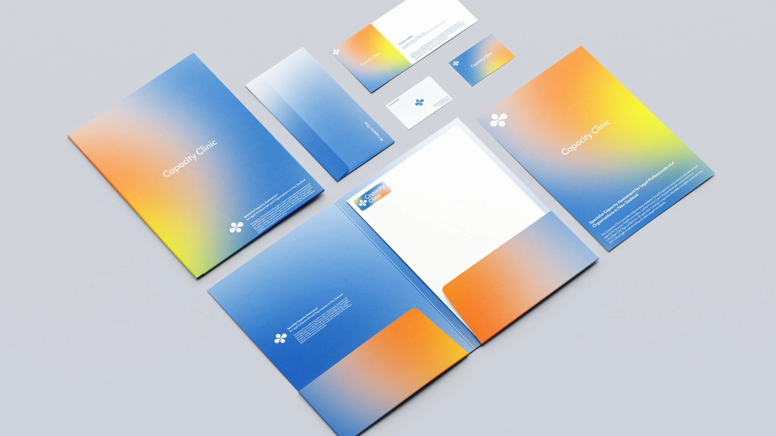
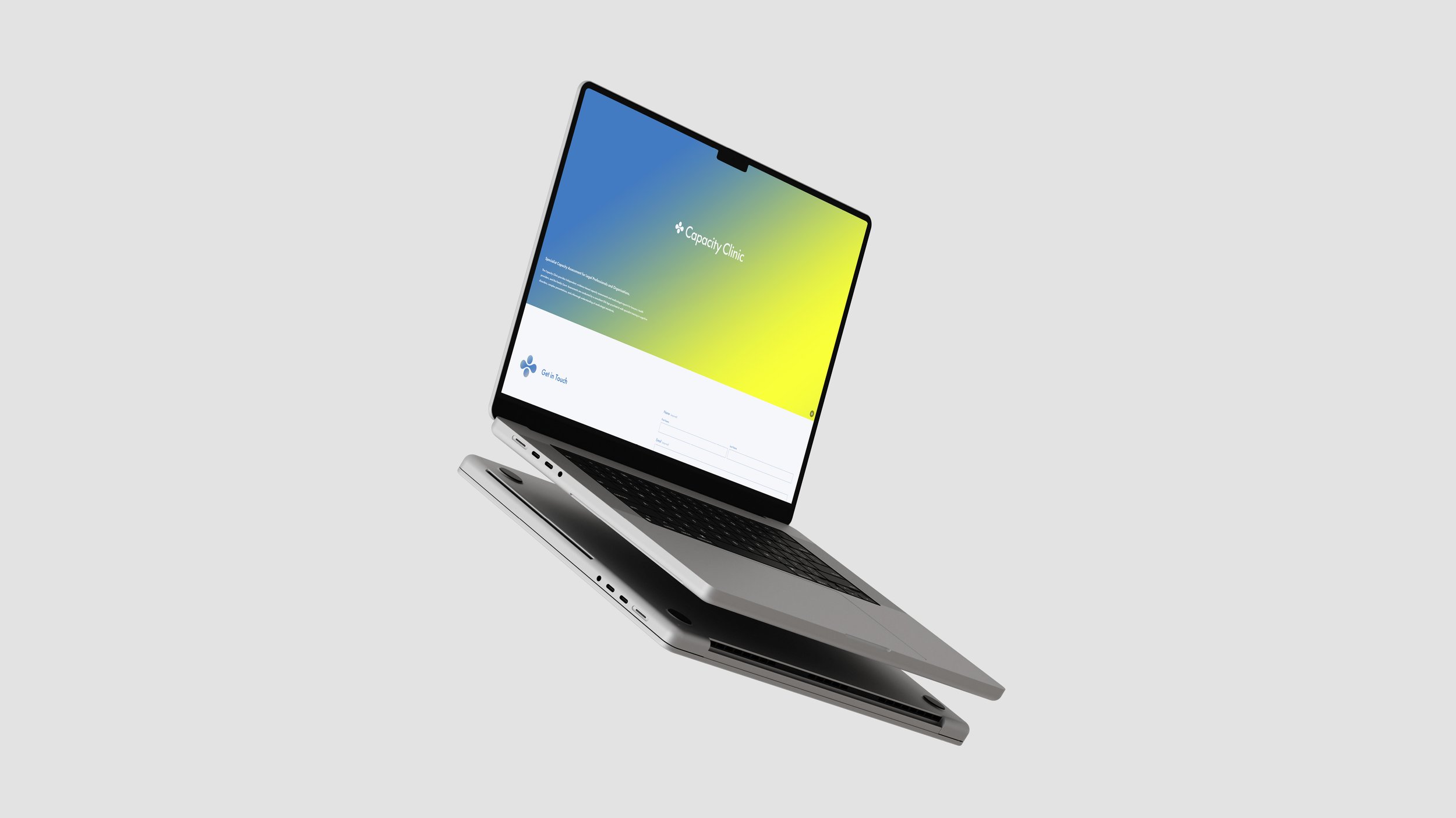
The final icon brings science and care together. It carries the ideas of connection and decision making, both of which sit at the heart of capacity assessments. It reflects the brand values of clarity, calmness, and professionalism. The rounded edges create a sense of comfort and safety for clients and families, while the clean geometry gives lawyers and organisations confidence in the service.
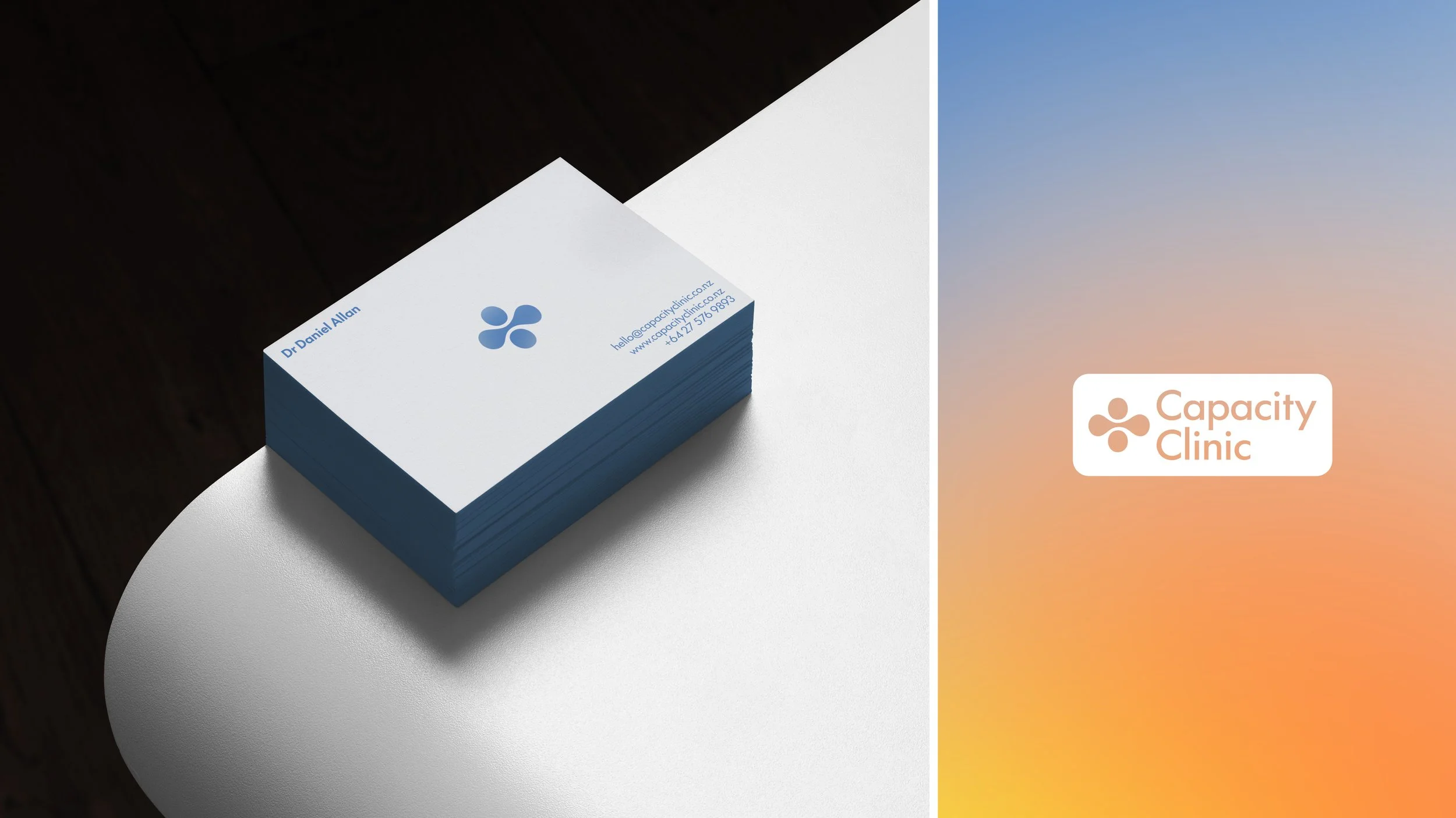
The result is a visual identity that feels thoughtful and intentional. It gives Capacity Clinic a symbol that holds meaning at every level and can be used across all brand materials with strength and consistency.