BOZ
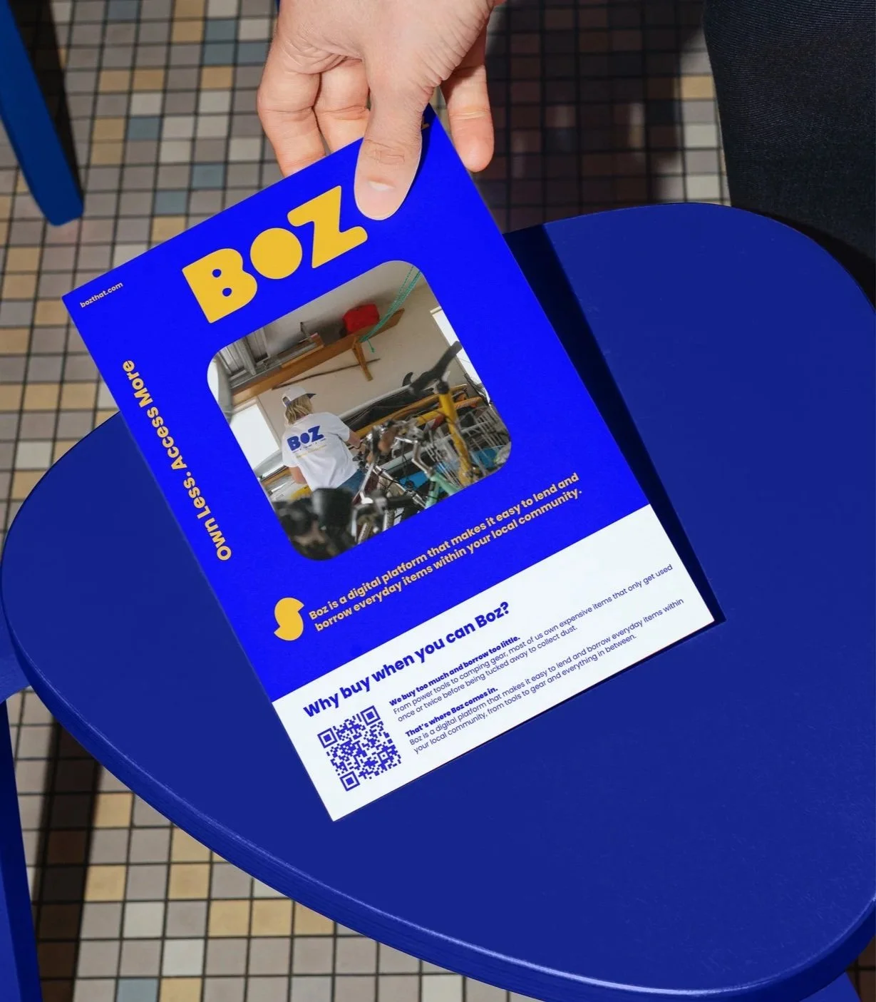
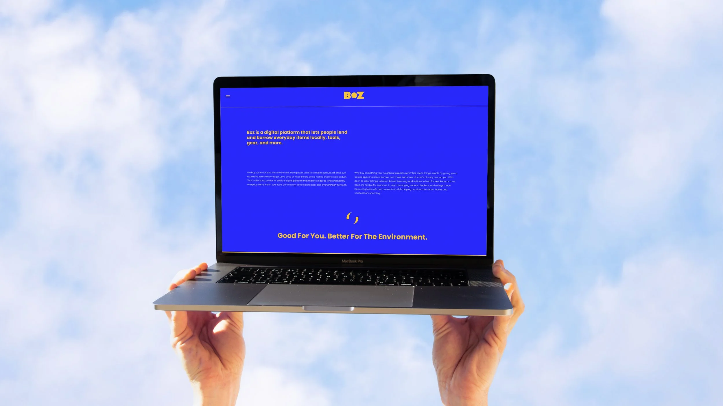
Boz is a digital platform that lets people lend and borrow everyday items locally, tools, gear, and more. We buy too much and borrow too little. From power tools to camping gear, most of us own expensive items that only get used once or twice before being tucked away to collect dust. That’s where Boz comes in. Boz is a digital platform that makes it easy to lend and borrow everyday items within your local community, from tools to gear and everything in between.
The Icon
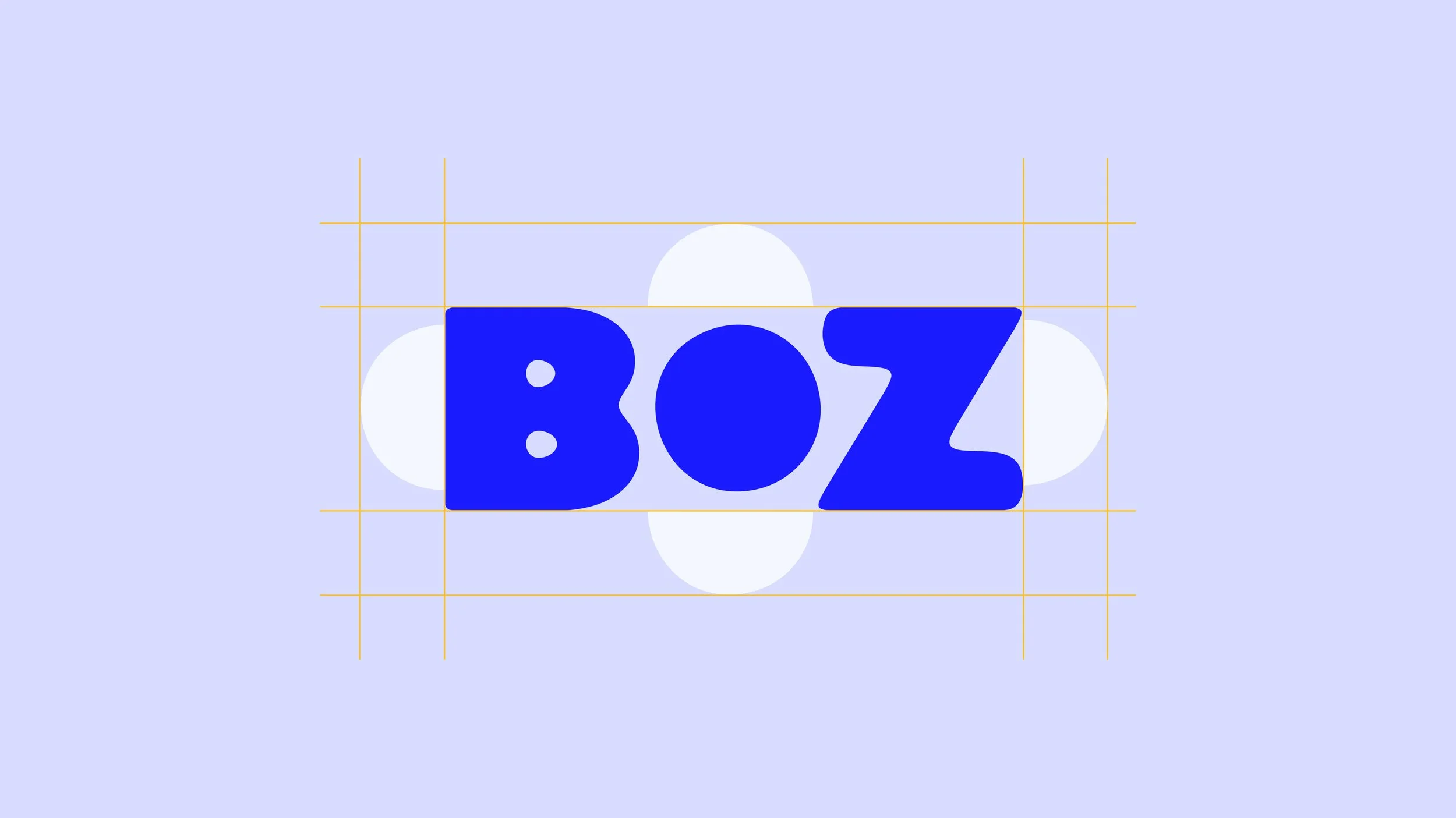
The Boz logo is a visual representation of the platform’s purpose. The B represents the borrower, the Z represents the lender, and the O in the centre symbolises the app itself, the bridge that connects them. The shape created where the B and Z are joined by the O represents that key moment of connection, where borrowing and lending meet through the BOZ platform. The logo’s soft, rounded form is intentionally playful and approachable, reflecting Boz’s friendly and inclusive personality. This approachable tone will carry through in the brand’s voice. Boz is here for everyone, accessible, and grounded in community. The logo stands apart from competitors in the market, confidently carving out a fresh, welcoming identity.
Brand Mark
The brand mark is what happens when the B and Z come together, this is BOZ. It forms the app icon and serves as a standalone option for the brand mark. On the next page, you’ll see how the negative space within this version can also be used creatively as a secondary icon.
Secondary Icon
The secondary icon is derived from the negative space created by the primary brand mark. It can be used across branding and marketing materials as a subtle yet distinctive element. This icon is especially effective when the full text logo or primary icon has already been used, offering a fresh but cohesive secondary branding option.