

Arlo
Arlo
Arlo, affectionately known as “everyone’s favourite neighbour,” is a vibrant new restaurant nestled in the heart of Cashmere Hill, Christchurch. The name 'Arlo,' rooted in Old English and meaning "fortified hill," reflects the venue’s rich connection to its natural surroundings and historical significance as a cultural hub.

Coffee Culture Canned Coffee
Coffee Culture Canned Coffee
Packaging, Photography
I designed the packaging for Coffee Culture's new canned coffee, ensuring it stayed true to the brand while also standing out with its own unique vibe. We aimed for a light and bright design to perfectly capture those summer vibes!

Ora
Ora
The logo design builds on these ideas, weaving cultural meaning with visual harmony: The “R” and “A” interplay like yin and yang, symbolising the balance of fitness and wellness. Food and energy, body and mind – each depends on and supports the other, creating a state of flow. Circular elements in the logo embody balance and connection. The large “O” represents the main Ora Café, while the smaller circle nods to Little Ora, its smaller counterpart on-site.
To add a playful touch, I designed a unique pattern featuring stylised icons of people enjoying sports – a nod to the activities within the Recreation Centre. These icons seamlessly extend the Ora brand.

Earl X Wet Jacket
Earl Kitchen Collection
Design, Packaging
I had an incredible time working on the Earl 2025 Kitchen Collection! This project involved creating a cohesive design style that’s featured across a calendar, a wine label, and a few other exciting surprises coming soon. For the calendar, which showcases 12 mouth-watering recipes from the talented chefs at Earl, I not only designed the layout but also photographed each dish.
This project was such a joy to bring to life, and I can’t wait to share more as it all unfolds in the new year. In the meantime, head over to the Earl website and grab your limited edition 2025 Earl Calendar before they sell out!

Sumner Post Office
Sumner Post Office
Website, Photography, Social Media Launch
After developing the brand colours, I created a unique style for the Sumner Post Office website. The goal was to keep the design modern and clean while adding a fun twist—so the homepage was designed to look like a postcard, a nod to the restaurant’s location in the town’s historic post office.

Earl Coffee Cup
Earl is your neighbourhood bistro, so we designed a custom coffee mug and icon just for our community. The goal? A unique design that stands apart from the main brand while still tying into the Earl Kitchen Collection.
For this design, I wanted to keep things casual and rustic, reflecting the warmth of a neighbourhood bistro. The hand-drawn noodle illustration has an organic, sketch-like feel—imperfect in the best way—making it feel approachable and personal. Framing it within an arch creates a cosy, inviting touch, almost like looking into a little window of Earl. I kept the typography simple and curved it around the design to blend seamlessly. And, of course, the earthy orange adds to that comforting, lived-in charm. It’s a little piece of Earl you can take home!

Brandon W
Brandon Woelfel
Branding design crafted for New York Photographer and YouTuber Brandon Woelfel (@brandonwoelfel), aimed at infusing his vibrant photography style with a fun and bold visual identity. The main logo serves as a nod to the refraction of light, a technique frequently employed by Brandon in his photography, capturing the essence of his distinctive style.
Developing a comprehensive brand package, incorporating a captivating design element that could seamlessly complement his imagery and double as a versatile pattern overlay. Inspired by Brandon's adeptness in manipulating light to create intricate patterns in his work, we designed a dynamic element that embodies the essence of light and its reflective properties.
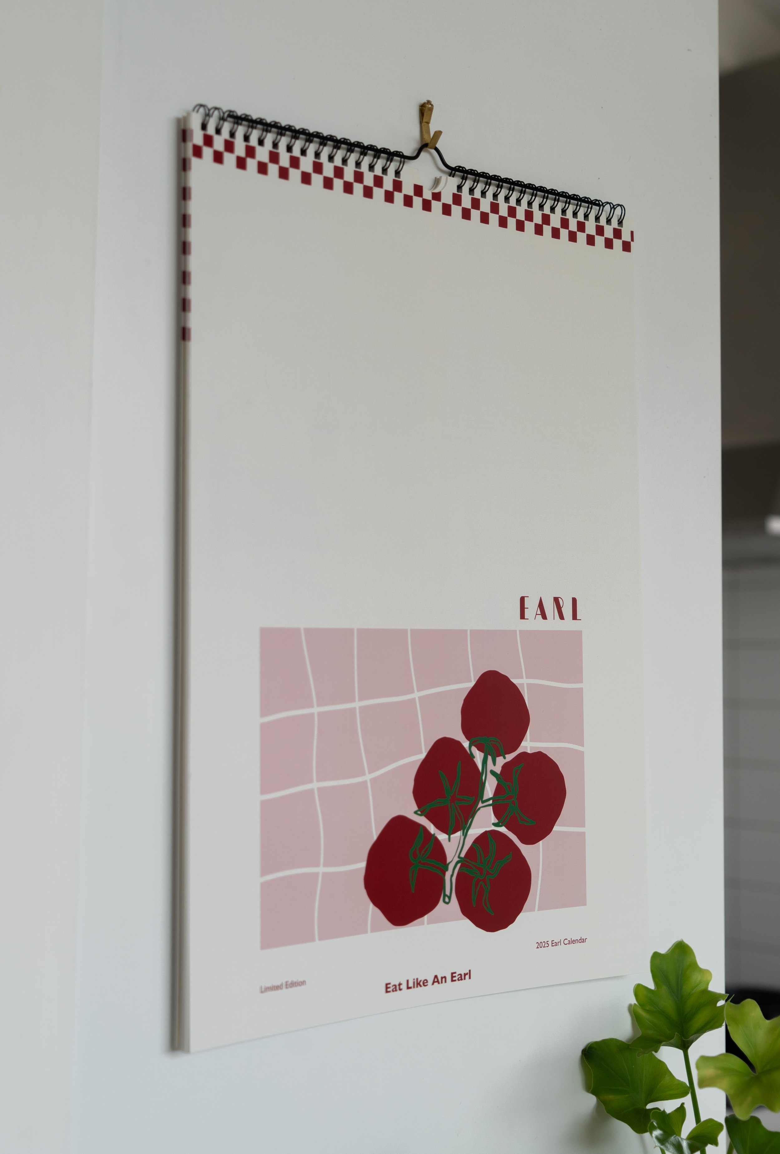
Earl Kitchen
Earl Kitchen Collection
Design, Packaging
I had an incredible time working on the Earl 2025 Kitchen Collection! This project involved creating a cohesive design style that’s featured across a calendar, a wine label, and a few other exciting surprises coming soon. For the calendar, which showcases 12 mouth-watering recipes from the talented chefs at Earl, I not only designed the layout but also photographed each dish.
This project was such a joy to bring to life, and I can’t wait to share more as it all unfolds in the new year. In the meantime, head over to the Earl website and grab your limited edition 2025 Earl Calendar before they sell out!

Figure 9.
The Figure 9 Studio
The Figure 9 Studio brand colours symbolise the abundance of plants that fill the Figure 9 Studio space. The greens and blue evoke feelings of calm, tranquillity, and a connection to nature. I aimed to craft a brand icon suitable for merchandise — a symbol that people would proudly wear and identify with. Emphasising the elegance of the “f” and “9,” I sought to create a visually appealing and meaningful shape.

Four Physio
Four Physio & Health
Branding
The logo incorporates flowing elements, like the ‘o’ merging into the ‘u,’ reflecting the principles of Pilates. The balanced circle on the ‘f’ symbolises equilibrium, mirroring the concepts of physiotherapy and Pilates. The choice of warm and inviting colours, including orange and peach, aims to establish a cosy and comforting atmosphere.

Hampton Grove
Hampton Grove
Branding, Website
Branding design for Prebbleton’s latest residential development, Hampton Grove, situated in the sought-after village of Prebbleton, nestled along the serene rural boundary, offering an unparalleled living experience. The design ethos aimed for elegance and timelessness, with colours mirroring the lush greenery of the surroundings.

RC Restructuring
RC Restructuring
Branding, Website
This project was a journey of bringing together professionalism, clean aesthetics, and user-friendly navigation into one cohesive brand experience. Creating both the brand and the website has allowed for a seamless integration of visual elements and functionality.

Three Peaks
Three Peaks Studios
Three Peaks Studios is a dynamic video and photography studio situated in the scenic surroundings of Taupo, New Zealand.
The name ‘Three Peaks’ is a nod to its scenic Taupo location, offering a stunning view of the mountains in Tongariro National Park across the lake. The logo design reflects the contours of Tongariro National Park, capturing the essence of this scenery.

Jacinda C
Jacinda C
I had the privilege of crafting a brand for Jacinda C, a mindfulness and movement coach based in Ōtautahi, New Zealand. The brand concept draws inspiration from the vibrant and energetic aesthetics of 90s sports fashion. My aim was to infuse a sense of playfulness into the brand, creating a unique identity that not only stands out but also evokes a dynamic spirit.


S.I Chauffeurs
South Island Chauffeurs
The icon merges the letters S, I, and C to create a design resembling the long, winding roads of New Zealand’s South Island. Reflecting a seamless journey, the design embodies the essence of traveling with South Island Chauffeurs. The dot atop the “i” resembles a car traveling along the road, while the S and C elegantly represent the winding roads. The colours were chosen to reflect an elegant and luxurious aesthetic.

Happy Whole Foods
Happy Whole Foods
Branding, Packaging, Photography
Branding, packaging, and photography for Happy Whole Foods. The brief was to create a fun and playful design that appeals to both parents and children.

Humble Brag
Humble Brag PR
Branding and website design for Humble Brag PR, a local PR company that doesn’t take itself too seriously but takes your brand seriously. We wanted the design to be clean and professional while incorporating an element of fun. The brief was to create a logo around the brand name Humble Brag, so I designed a main logo along with a couple of icon options.