Peachly
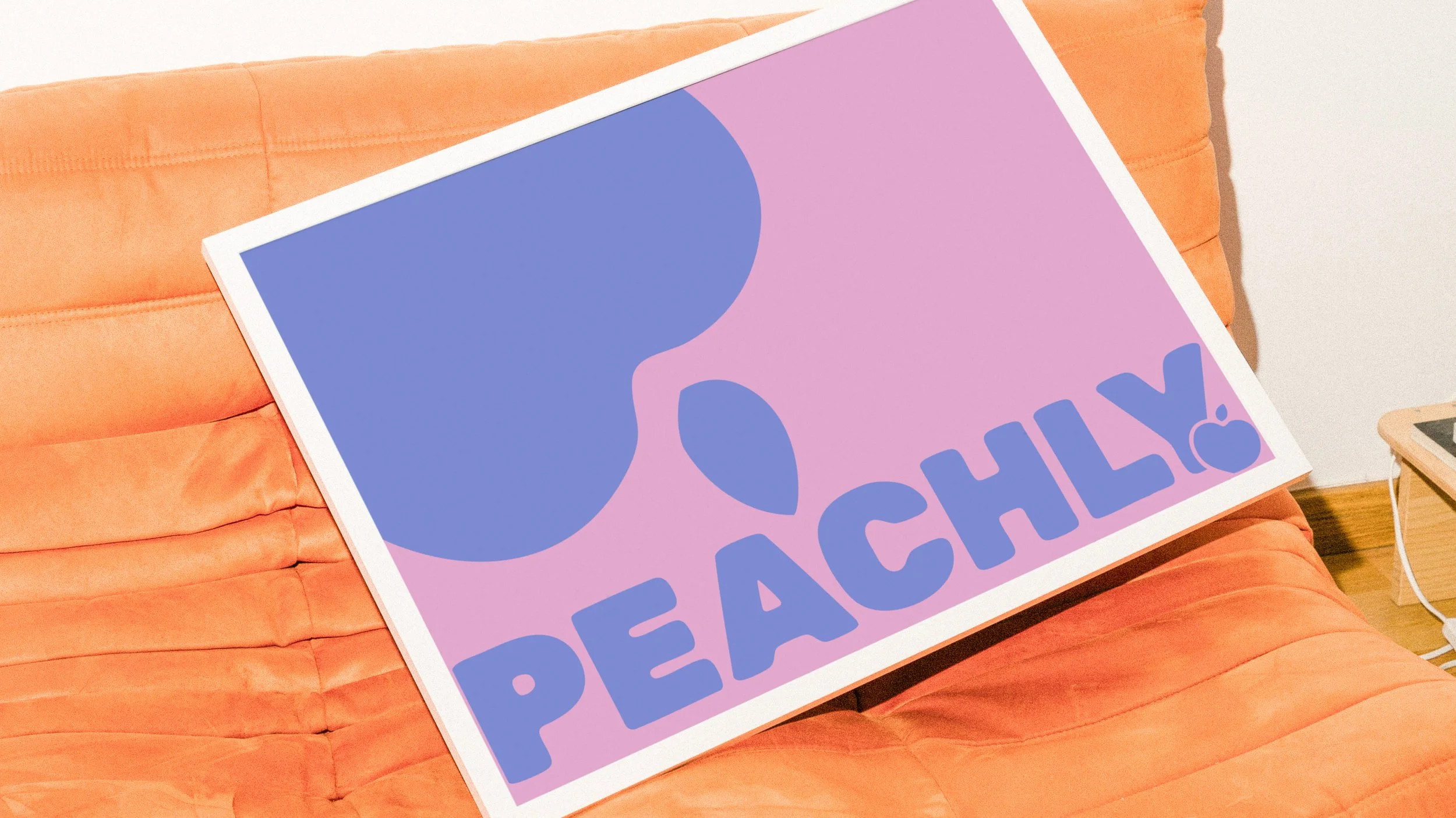
The Peachly identity was designed to balance warmth with innovation.
Rounded typography and soft shapes introduce an approachable, human feel, while the clean structure keeps the brand confident and professional. This contrast reflects Peachly’s core philosophy: marketing that blends creativity with logic, and human connection with data-driven strategy.
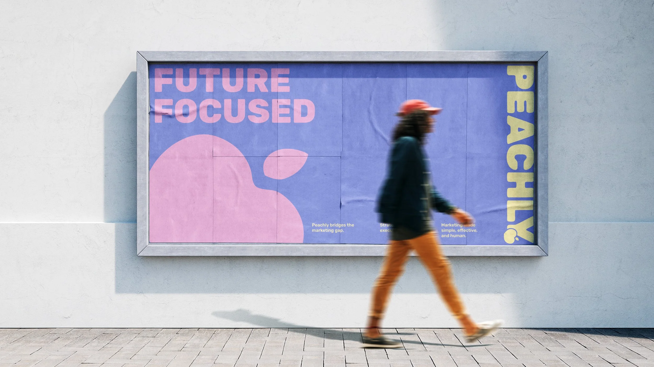
At its centre, the brand is future-focused and people-first. Peachly combines creativity, technology, and strategy to help businesses grow with intention. The visual identity mirrors this balance, feeling bold and modern while staying grounded in authenticity and real connection.
The colour palette was created to feel bright, fun, and full of life, while still offering the flexibility to soften or tone things down when needed. Peach sits at the heart of the palette as the hero colour, chosen for its warmth, approachability, and direct connection to the brand name. This balance allows the brand to feel energetic and expressive without losing its sense of polish.
Negative space is used deliberately to create breathing room, allowing colour and messaging to stand out without overwhelming the viewer. Paired with punchy, attention-grabbing taglines, the result is a brand that feels clean, energetic, and distinctly memorable, built to cut through in a competitive marketing landscape.