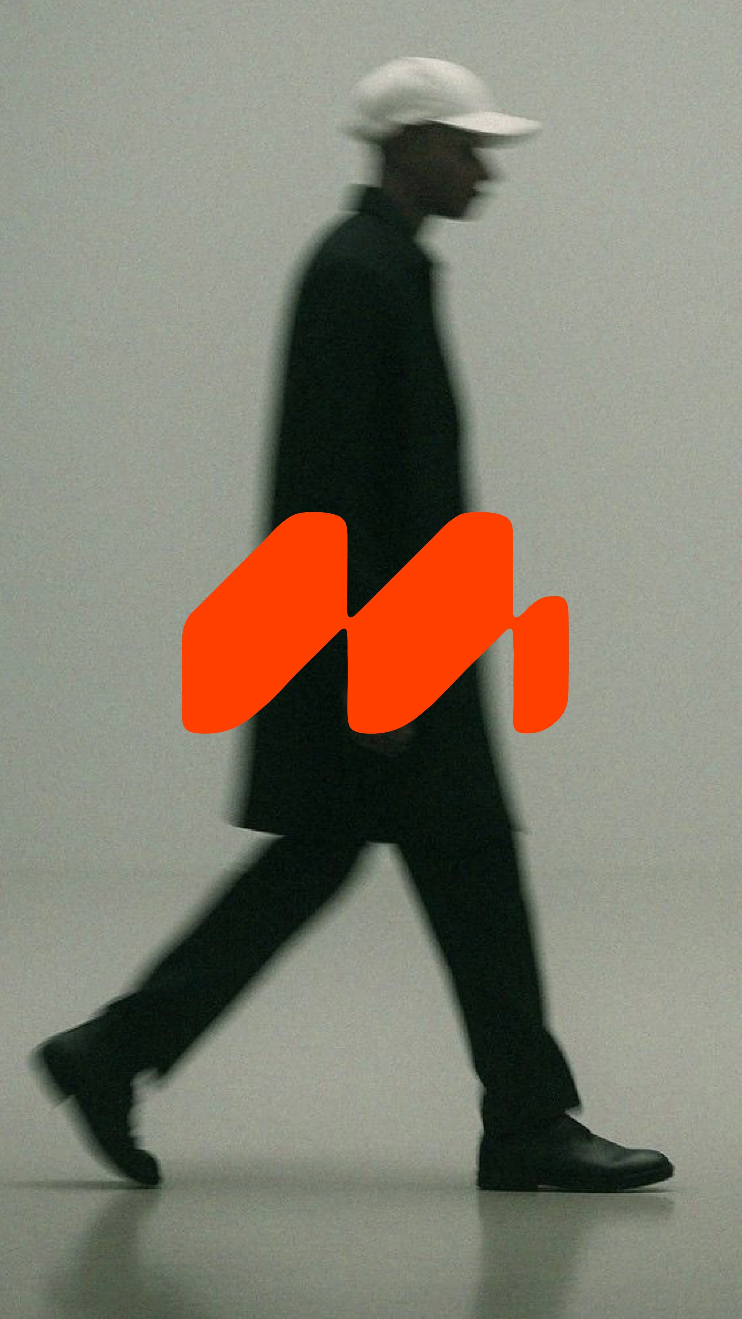
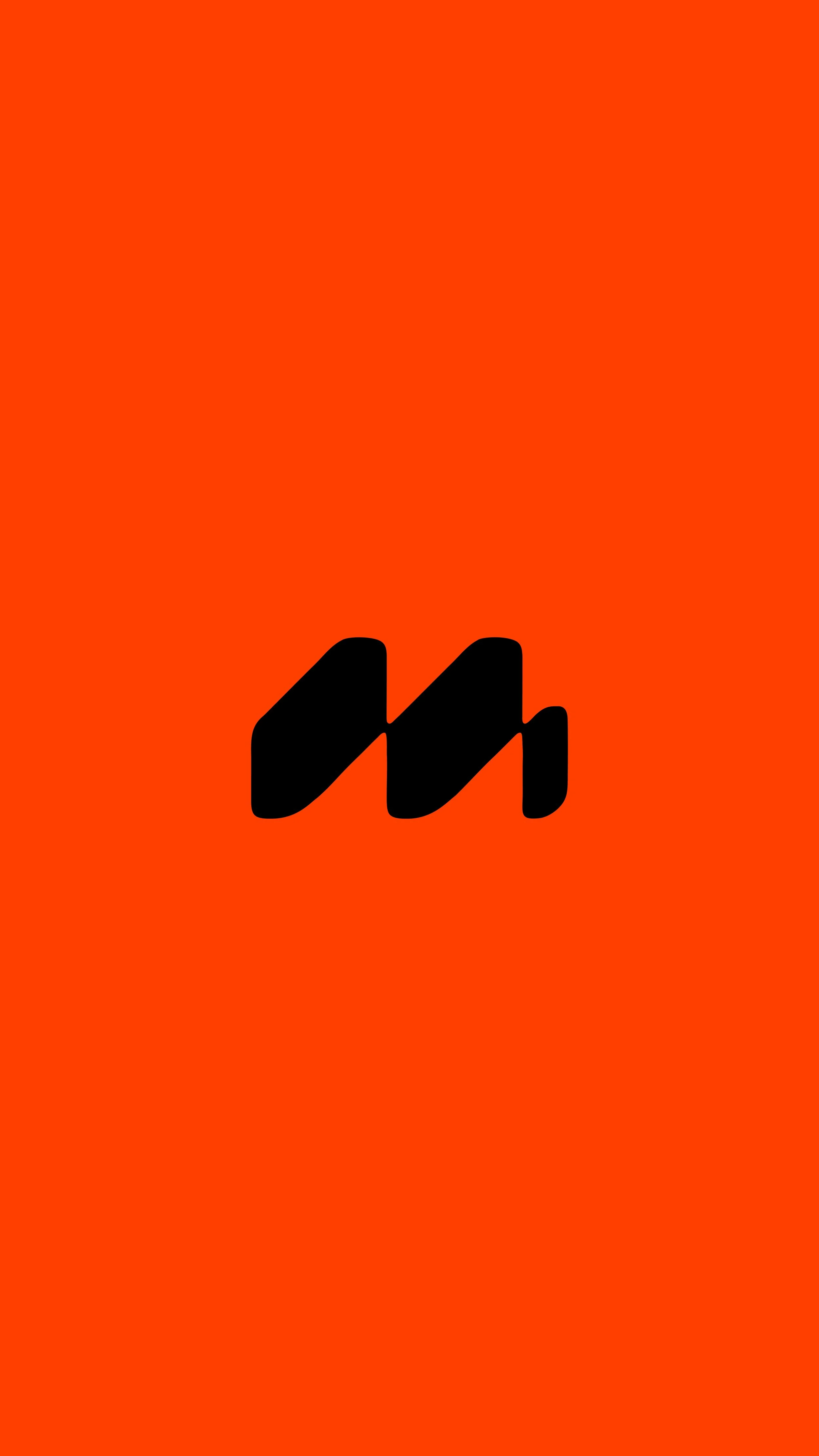
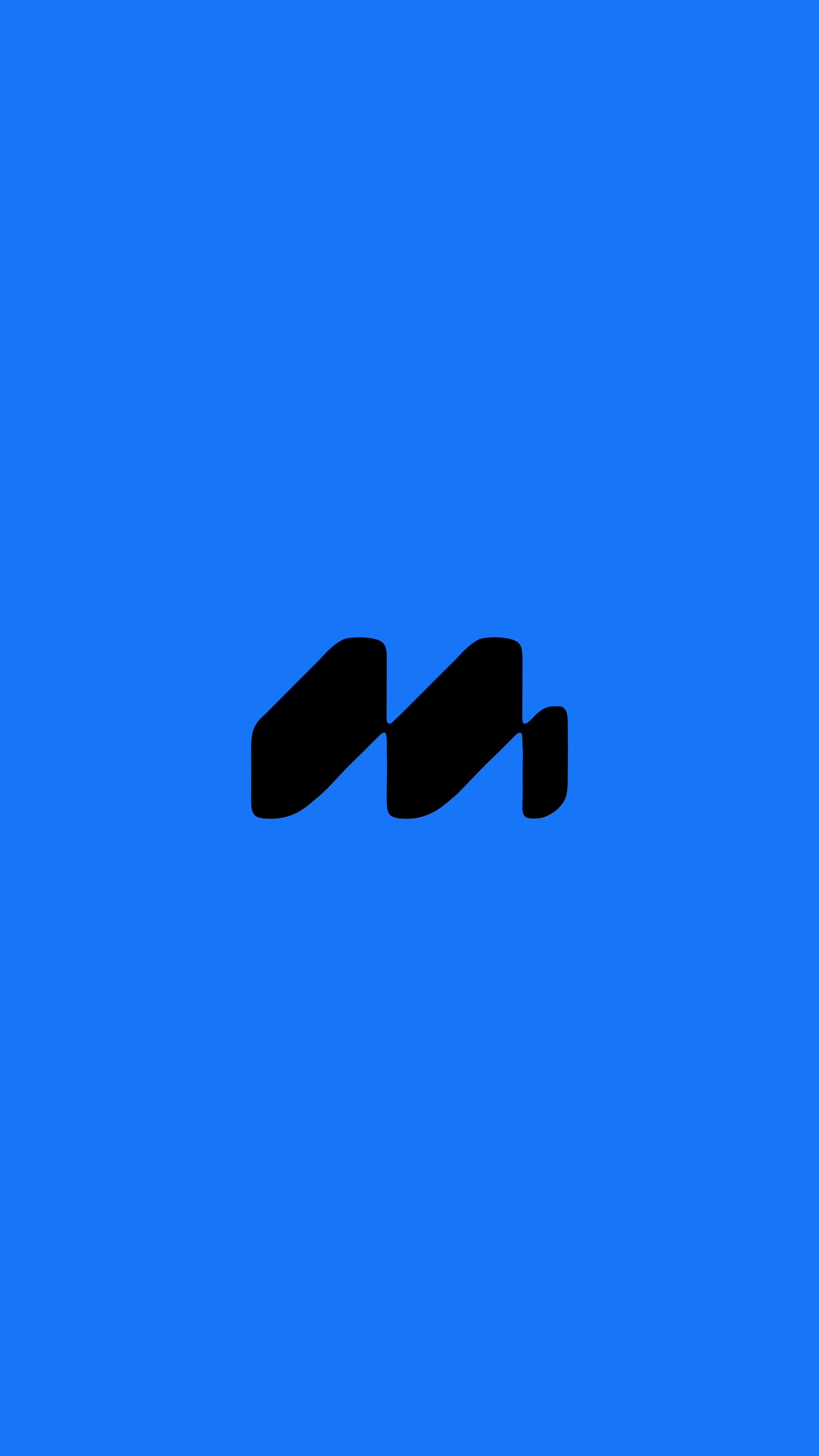
M - Brandmark
This brand mark was originally created for a client, though it didn't make the final cut. It's a concept I'm still proud of and wanted to share here. If you're interested in purchasing this brand mark, feel free to get in touch for more information.
The Brand Mark
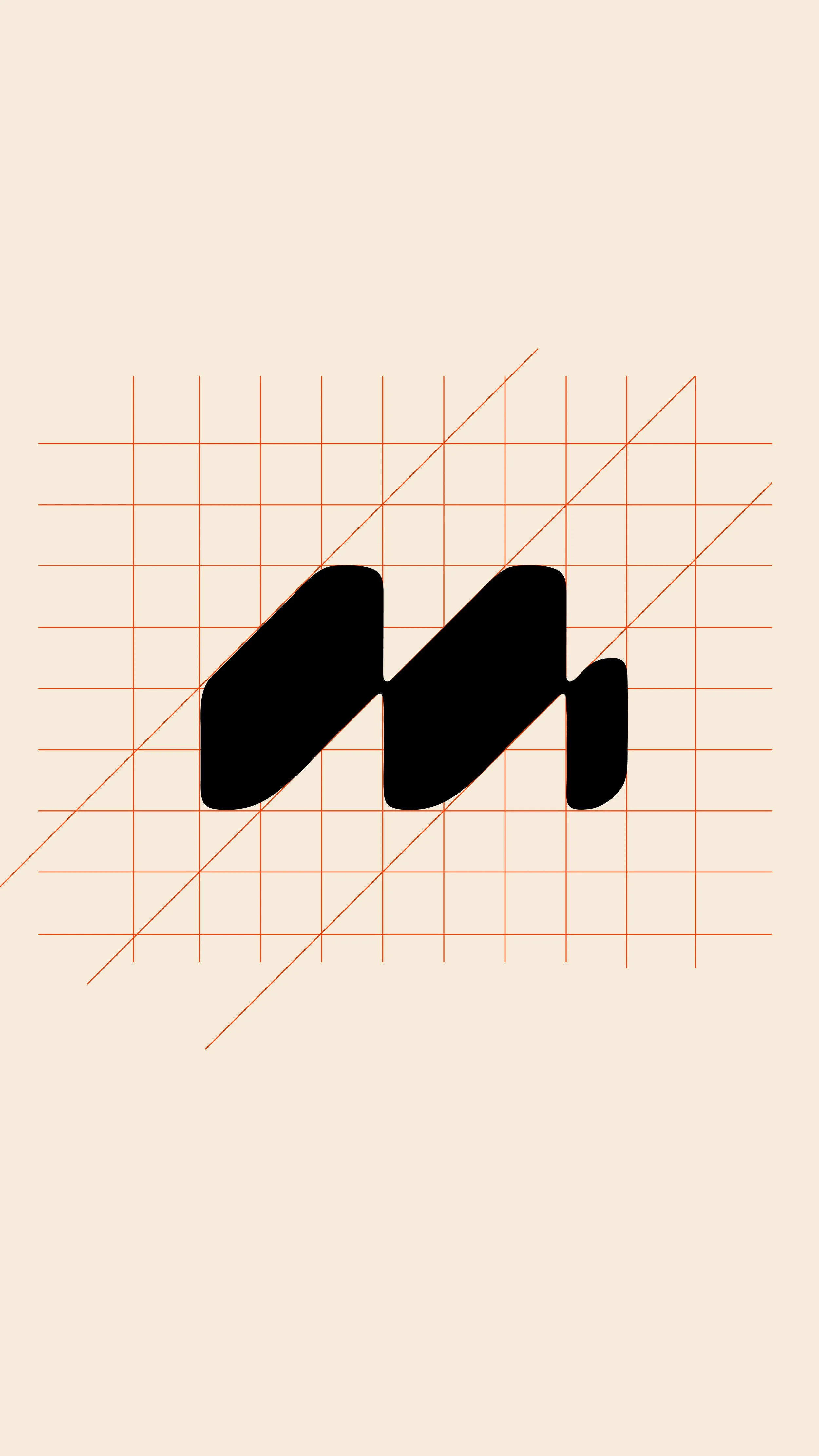
This brand mark was built within a grid system, rooted in the Bauhaus principle of form follows function. This is because the business has a very early-20th-century modern design in its office space and even has Bauhaus artwork on the walls.
The upward movement toward the right was intentional too, a subtle nod to growth and progress, echoing the shape of an ascending graph line, something the business also worked closely with. Two forms moving together represent partnership, the relationship between a business and the clients it works alongside.
In refining the concept further, I shaped it into a recognisable 'M' and softened the edges, aiming for something that felt more approachable and human without losing the structure underneath. This reflects what the business is all about: a serious, structured side, balanced with a personal touch and warmth in having someone alongside you in business growth.