Godfreys Law
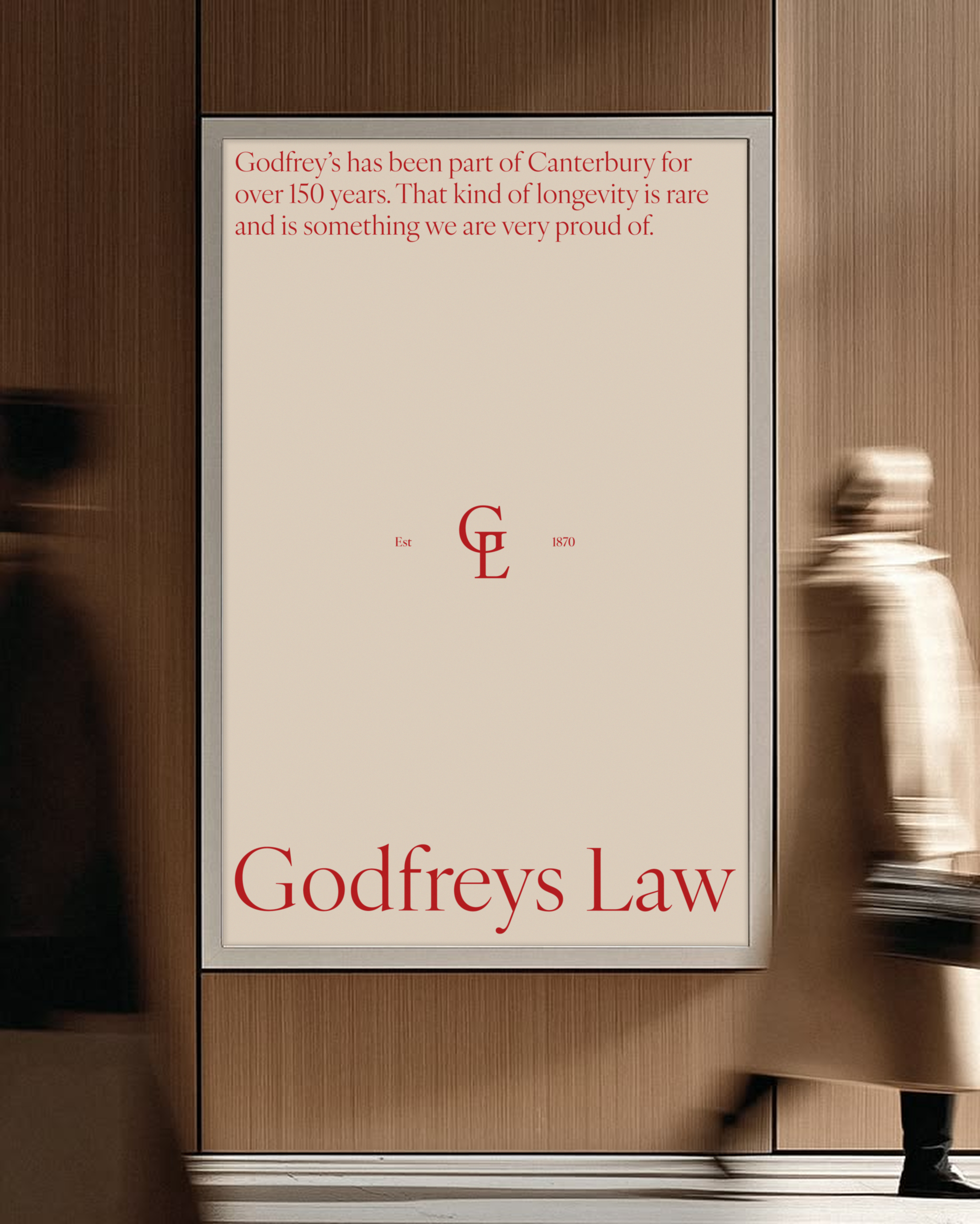
At Godfreys Law, you’ll find real solutions from real people. They combine legal expertise with genuine compassion, bringing a modern, human approach to the law. Godfreys has been part of Canterbury for over 150 years. That kind of longevity is rare, and it’s something they’re very proud of. So when approaching this rebrand, I had to keep these key themes at the heart of it.
I worked with Godfreys on a full rebrand, including brand strategy and visual identity, marketing strategy, and website design and development. I even went in and did a photoshoot to really show this human approach.

The Typography
I used typography to express the combination of a heritage brand with modern values. These two ideas can live side by side, just as they do in the business itself, where history and prestige meet new ways of thinking. A lot of people associate serif typography with old-school, traditional brands. This is because serif letterforms are the oldest and most direct ancestors of the alphabet we use today. Before the 1800s, almost all printing and written text used serif fonts, which is why we naturally connect serif type with history.
In contrast, people tend to think of sans serif typography as more modern. As mass production and commercial advertising exploded in the early 19th century, printers needed bold, heavy typefaces that could grab attention, and this is how the sans serif typeface was born.
For Godfreys, I chose a modern serif as both the logo font and the headings font. IvyOra Display is a modern take on 17th-century Dutch typography. In 2001, designer Jan Maack discovered two original Dutch Baroque typefaces, Cleene Canon and Ascendonica Romein, and drew on that history to create a new typeface that is both modern and historical, much like Godfreys itself.
For body copy, I wanted to play on this idea of the old and the new again. People often associate sans serif typefaces with modern brands, which is why I chose Aktiv Grotesk, a grotesque typeface. Grotesque typefaces were the first commercially popular sans serif typefaces, developed in the early 1800s. So the heading font is a new version of an old style, and the body copy is built on an original, older form of a style people see as modern.
The Brand Mark
The brand mark is built directly out of the brand typography, for a few key reasons.
The first is familiarity. Godfreys is already recognised through its wordmark, and the firm has previously used a standalone “G” as an icon. Rather than straying too far from this, the monogram keeps that same thread running through the new identity.
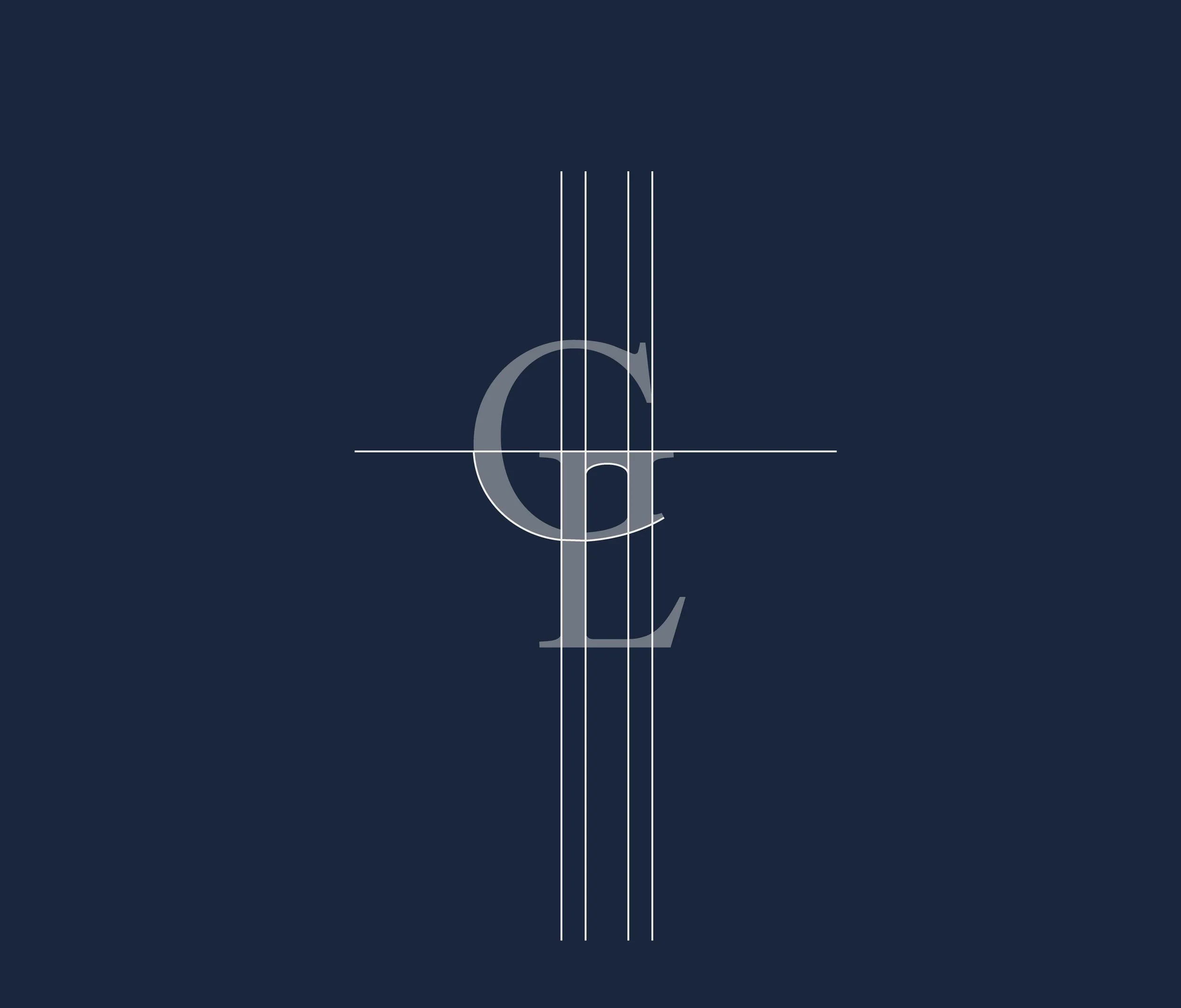
The second reason is more conceptual. So much thought had already gone into the choice of typography that building the monogram from it carries that history into the icon itself. The modern-inspired serif meets the original inspirations it draws from, brought together into a single mark. There’s also a strong historical precedent for this approach. Monograms are one of the oldest forms of branding, dating back as early as 350 BC, and were historically used to signal prestige and identity. Bringing back this old style of mark, but executing it in a modern way, reinforces the theme running through the entire visual identity: old prestige meeting new ways of thinking. I took the G and the L from Godfreys Law and merged them together to create the mark.
I was also inspired by Godfreys’ 150 years in Canterbury, which led me to landmarks around the city that could be woven into the branding, places that have stood strong even through the earthquakes. The Bridge of Remembrance came to mind, so there’s a slight nod to its shape in the way the G and L connect, with the curve of the G also representing the flow of the Avon River beneath it.

The Photoshoot
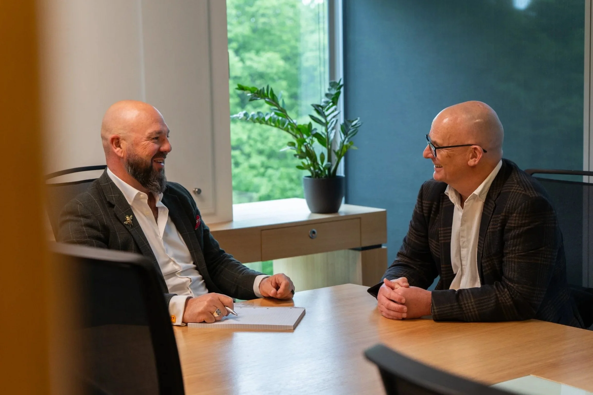
Photography is a huge way for Godfreys to show their personality and what makes them different. When I went in for the photoshoot, the goal was to capture images for the website as well as social media content. I wanted to avoid the classic lineup style of headshots, and instead used different levels and natural composition wherever I could. I was also looking for warm, engaging smiles that felt genuine rather than posed, and a range of imagery that could be used across documents, social media and the website. The images work the same way stock photography does, but they’re entirely Godfreys’ own.